READ MORE

Case Study1B


2D/3D HYBRID ANIMATION / 2016


WATCH

PROJECT OVERVIEWRÉSUMÉ DU PROJETプロジェクト概要

“June” is the story of a woman becoming reconnected with and exploring her community through ridesharing. Conceived as a promotional film for rideshare service Lyft by Academy Award-winning director John Kahrs, it showcases many of the beautiful neighborhoods of Chicago and its diverse citizens. John approached Chromosphere to help bring this world to life.

We were given the keys and were completely in charge of the execution of the piece, all the way from concept design to animation to final picture.

WATCH

DEVELOPMENTDÉVELOPPEMENTディベロップメント


KEVIN: Our involvement began with a research trip to Chicago to immerse ourselves in June’s world and see Chicago through the eyes of some of the Lyft drivers who work there. Through the stories they told us and the locations they showed us, we were able to form an idea of where June might live and what places might be interesting for her to visit throughout the story.

This trip was also instrumental in starting to form an idea for a visual approach to the film. Several times when we drove or walked underneath the L-train tracks I was struck by converging perspective lines of the steelwork and cables. It made me think about colorful kaleidoscopes, or the sparkling, twirling reflections on a car’s hubcap. This was the first thought of what became a central design motif throughout the project, and led us to try to incorporate a kaleidoscope-like pattern into every background and also inspired the eye-catching transitions during the musical montage.

^ PHOTO REFERENCE GATHERED ON THE RESEARCH TRIP TO CHICAGO

One of the first artists I wanted to bring on to start to visualize our stylized version of Chicago was Théo Guignard. Théo’s work is filled with vibrant and playful colors and beautiful graphic shapes. He has a particular way of capturing cityscapes that feels both realistic and almost toy-like. To me the story of June always sounded like a “day in the life” documentary, so I thought Théo’s incredible sense of lighting could lend a lot to that idea.

^ EARLY COLOR THUMBNAILS PAINTED BY THÉO GUIGNARD

The photos we took on our research trip became a constant reference point for the whole design team who constantly went back to look for more details and more ideas that could help flesh out the world. Many of the shots in the film ended up being directly referenced from some of these photos.

^ LEFT: LAKESHORE DRIVE BACKGROUND PAINTED BY JASMIN LAI, BASED ON A THUMBNAIL BY THÉO GUIGNARD / RIGHT: BACKGROUND PAINTED BY SYLVIA LIU

DESIGNDESIGNデザイン


THE WORLD

JASMIN: In addition to the research trip photos, we would also sometimes drive around on Google Street View looking for exact street corners or bridges that we wanted to reference for a specific shot. It was really important to us to make the locations feel as accurate as possible.

The colors were also super important to capturing the right feeling of Chicago. Théo would use really unusual colors in his thumbnails to capture a certain feeling, whether it was a time of day or a particular type of light that was striking. His early color thumbnail explorations provided an amazing palette for us to work from, and many of them turned into exact shots in the film.

Incorporating the kaleidoscope pattern into each background was easier for some locations than others. We typically looked for compositions with clear vanishing points to create the kaleidoscope lines so the pattern fit in very naturally. Other times we had to be more creative to find ways to fit the idea in, like in the shot with June’s garage where the vanishing point is completely covered up. We would look for buildings and things like light in the trees that could align nicely with the kaleidoscope lines.

Overall the style of the film is very shape focused, and we tried to work in as many exciting little shapes and details so that there would always be interesting things to look at!

^ THUMBNAILS FOR JUNE’S HOUSE AND NEIGHBORHOOD BY THÉO GUIGNARD

KEVIN: We wanted to the world to feel really believable, as if you could step right into it. Because of this we were always pushing to have some big cinematic moving camera shots that could show off the dimensionality of the world. One shot where we did this was when June is leaving her house in Bronzeville and drives under the L-train. To make this shot, Théo first designed the start and end positions of the camera move so that we could visualize the whole thing. Because the style was so graphic, bringing that design into 3D meant that the scenes had to be constructed in a way that made use of a lot of 2D artwork placed on cards in 3-dimensional space, with a few select elements close to camera completely built out. For many of these scenes we had help from Denis Bouyer and the team at Feed Me Light.

^ PROCESS FOR ESTABLISHING SHOT OF JUNE’S NEIGHBORHOOD / 3D SET BY DENIS BOUYER, 3D ANIMATION BY NELSON BOLES, COMPOSITING BY STÉPHANE COËDEL

Another very interesting scene is the one where June is driving along Lakeshore Drive on her way to buy a new car. This shot was based on a really cool thumbnail Théo had done. It was very flat but we really wanted to turn it into a dimensional helicopter shot, so Denis built out a 3D set in a very interesting way to create an illusion of depth that kept all of the design ideas intact.

^ LAKESHORE DRIVE 3D SET BUILT BY DENIS BOUYER

^ TOUR OF THE SIP & SAVOR SET BY THERESA LATZKO

THERESA: The sequence of the film that took place by the Sip & Savor cafe was staged on a fully 3D set, but we saw it primarily from 3 very specific camera angles. This allowed me to focus the attention and detail in the areas I knew we would see. It’s built from a combination of completely modeled set pieces as well as flat artwork floating on 3D cards, which were either pulled straight from Jasmin’s Photoshop paintings or re-painted as flat textures by me. The interior of the cafe is filled almost entirely with flat texture cards which were designed to work out just right for the shot we were doing, but would look completely wrong from any other angle. Because we had a lot of handheld camera motion in these scenes, the additional depth in the sets brought an extra lifelike quality to everything. I really enjoyed working on this scene because the cafe was so nice and bright and warm. Every time I would zoom in on that portion of the set I really felt like I was coming in out of a snowstorm and into a cozy and warm cafe.

^ PRELIMINARY JUNE DESIGNS BY TIFFANY FORD

THE CHARACTERS

KEVIN: Getting June’s design right was one of our most important challenges, and the process of finding her helped unlock answers for many other design problems in the film. John had a clear idea in his head of the character, and we had to figure out how to capture that person and also interpret her into the graphic style we were utilizing. In addition, the design needed to be robust enough to handle the types of subtle acting and performance animation that are characteristic of John’s work. This proved difficult because for the design to remain stylized and graphic you want to remove a lot of features that are typically used by animators to capture detailed performances.

I immediately thought of Tiffany Ford as the right person to create this character. From the first explorations she did for June, she was so full of personality and life. As we continued to work on her, the challenge became how to refine and stylize the design to fit into our world without losing any of the liveliness of those first sketches. Jasmin and Théo both pitched in with design ideas and there was a great back & forth process that led to the final design for June.

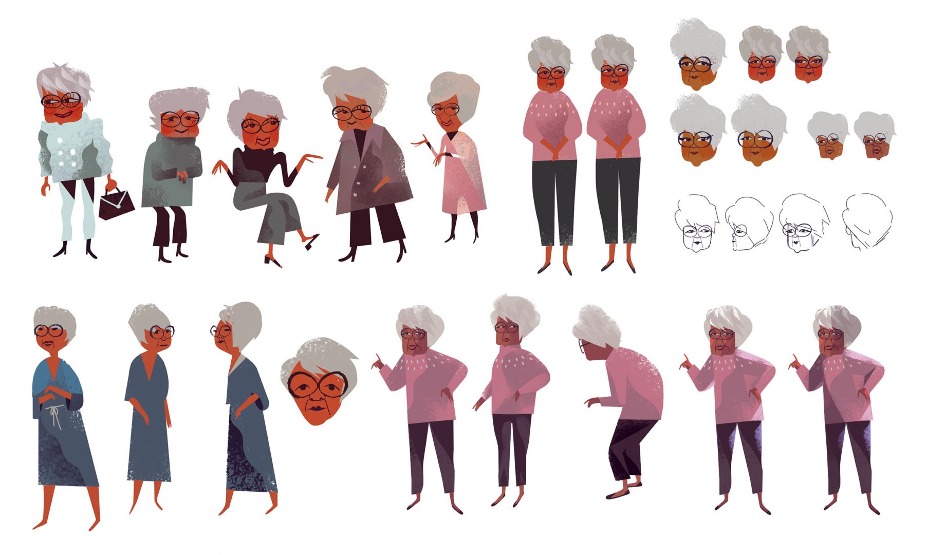
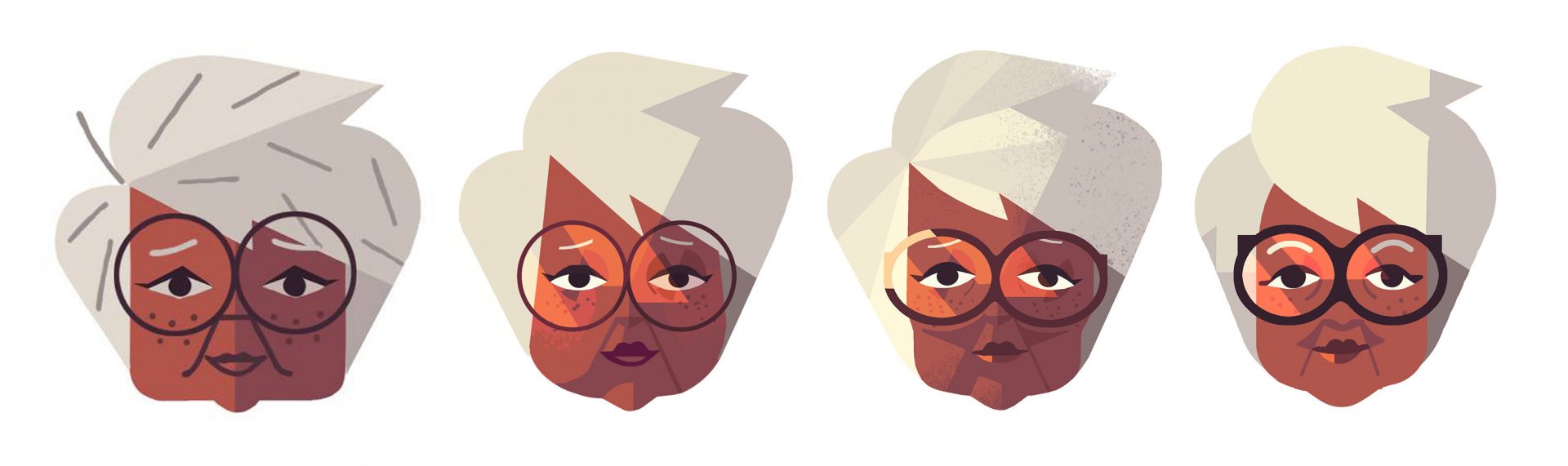
^ EVOLVING DESIGNS FOR JUNE’S FACE BY THÉO GUIGNARD, TIFFANY FORD, JASMIN LAI, & KEVIN DART

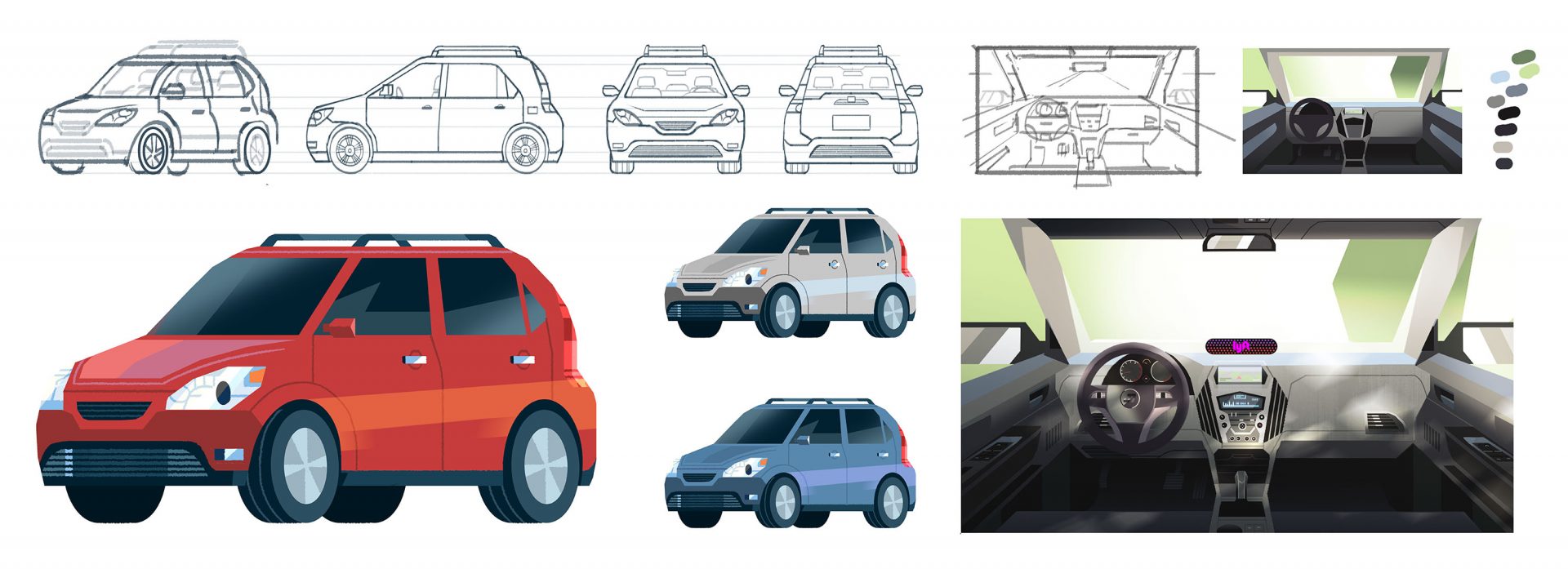
Once we had a solid design we also had to figure out how to translate it into 3D and maintain the same punchiness of the 2D design from every angle. Pedro Vergani came on board to create the character model, which also needed to have enough complex geometry to sell the acting, but not so much that we would lose the visual charm we were trying to achieve. Even once we got the flat shaded model to look clean and charming, the sharp lighting could sometimes reveal unappealing geometry underneath. It was a very tricky balance to find but was eventually solved through lots of trial and error!

< 3D JUNE MODEL BY PEDRO VERGANI

^ PEOPLE OF CHICAGO BY TIFFANY FORD

Once June’s design was solved, we had a reference point for what we were trying to hit with the character designs and Tiffany was able to start on the rest of the cast. We essentially gave her an assignment to just draw as many people as she could think of. She came up with an incredible group of people, full of color and variety and personality. From that group of people we were able to cast the film, picking out which people would be passengers, people on the street, cafe patrons, or any other person we needed. The process was super fun and I feel like the characters we came up with really represented a slice of the Chicago population.

^ DESIGNS FOR JUNE’S CAR BY ARTHUR CHAUMAY

THE VEHICLES

KEVIN: June’s stylish red SUV was designed by Arthur Chaumay. We spent so much of the film inside and around this car that a lot of care went into getting all the details just right. Many of the other cars that populate the world were made by our prop designer Emily Paik.

Something about the cars that we really wanted to capture well was the window reflections. Apart from the kaleidoscope patterns we noticed in Chicago, another thing that jumped out about the experience of riding around was all of the bright reflections of buildings and bridges dancing across the windows. It made me think of the classic film French Connection. One of the iconic sequences features a car chase under a train track much like the ones in Chicago, and you see parts of the bridge and all these details whipping by across the car’s windshield. Getting these reflections right seemed central to capture the experience of really being in a car.

^ WINDOW REFLECTION REFERENCE FROM THE FRENCH CONNECTION

We gave our head of lighting & rendering, Camille Perrin, the task of trying to come up with a shader that could create stylized, angular reflections on the cars. We found that the more randomized they were, the more believable they felt. Theo also incorporated lots of these sharp reflections into his thumbnails which provided a lot of inspiration for other ways to stylize them.

REFLECTION SHADER EXPERIMENT BY CAMILLE PERRIN >

^ PROGRESSION OF FIRST ANIMATED STYLE FRAME / 3D ANIMATION BY NELSON BOLES, COMPOSITING BY STÉPHANE COËDEL

STÉPHANE: After getting the CG reflection passes from Camille, I would use those in combination with 2D elements to get the most satisfying reflection effect. Every scene was treated a little bit differently to get the desired look. In the scene in the montage where June is driving the sleeping woman, I used a particle system of triangle shapes in addition to the CG reflections to create the feeling of passing under trees on a shady neighborhood street.
All of the reflections on June’s glasses were created by hand. I used my own feeling of how it should look and what would make sense for the scene. We were always trying to achieve a stylized sense of realism, but we would sometimes completely disregard reality in order to get an effect that just looked the best.

^ PROGRESSION OF JUNE WALKING THROUGH HER HOUSE / 3D ANIMATION BY NELSON BOLES, COMPOSITING BY ROB WARD

ANIMATIONANIMATIONアニメーション

NELSON: ‘Less is more’ was an appropriate approach for these characters. We took advantage of the graphic designs to favor simple yet strong poses. Using limited timing of 2’s and 3’s made shapes appear more like drawings which reduced any ‘3Dness’ to help blend with the 2D characters and backgrounds. Anywhere possible we broke and pushed the rigs to favor the camera angle and stay true to initial concept designs.

^ PROGRESSION OF JUNE TALKING WITH PASSENGERS / 3D ANIMATION BY NELSON BOLES, 2D ANIMATION BY JONATHAN DJOB NKONDO, COMPOSITING BY STÉPHANE COËDEL

KEVIN: A key part of the animation style has to do with the way we mixed 2D and 3D animation. While June and a few other main characters were 3D, we decided to make all of the secondary and background characters 2D because of schedule constraints. Before we started animation we went through the storyboard and picked out all of the characters that would have limited acting or only be onscreen once or twice. Jonathan Djob Nkondo handled all of the 2D animation by himself. His style was such a perfect fit. He had a great understanding of the acting subtlety we needed as well as the graphic visual style.

^ PASSENGER ANIMATIONS BY JONATHAN DJOB NKONDO

I was surprised by how seamlessly it all blended together in the end! The stylized lighting gave us a fair amount of leeway in getting the 2D and 3D characters to fit together well. We could even have June talking to a 2D character right next to her without any noticeable style mismatch. This was also a testament to the skill of the whole compositing team.

Jonathan also built a library of generic background character cycles that we re-used constantly in the backgrounds to make the world feel more populated.

^ BACKGROUND CHARACTER WALK CYCLES BY JONATHAN DJOB NKONDO

^ COMBINING 2D AND 3D ELEMENTS / 2D ANIMATION BY JONATHAN DJOB NKONDO, 3D ANIMATION BY NELSON BOLES, COMPOSITING BY ROB WARD

COMPOSITINGCOMPOSITING基礎の構成

STÉPHANE: One of the biggest challenges on this project was to keep the look consistent since we were mixing so many 2D and 3D elements together. When it came to lighting the characters, we would sometimes use the 3D lighting pass, while other times we would use it in combination with a 2D mask or even disregard it completely and draw a new, more abstract light shape. It was always a careful balance between creating a cool stylized look and creating something with a convincing, almost documentary-like ambiance to it.

^ LEFT: 3D ANIMATION BY NELSON BOLES / RIGHT: FINAL COMPOSITED PICTURE BY ROB WARD

We tried to stylize and control every single element of the final treatment, even down to the shapes of the lens flares. Using the optical flare plug-in we could design every element of our flares, so we were able to closely match the look of the artwork and capture the square flares that had been designed.

WATCH

^ PROCESS BREAKDOWN FOR CONSTRUCTING A FAUX 3D SET BY STÉPHANE COËDEL

The musical montage in the middle of the film uses some really cool kaleidoscopic transitions which were one of the more motion graphics-y elements in there. Kevin provided me with a styleframe of what he was hoping to achieve, which was based on the idea of the triangular reflections you might see in the rim of a car tire. To bring this idea to life, I used a distortion effect in AfterFX which will bring two corners of a composition in toward the middle and make everything wrap in a circle. I had to animate some masks with different colors, and then in combination with the distortion effect it would bring all of the masks to one point.


PRODUCTION CREDITSCRÉDITSクレジット

PRODUCED FOR LYFT BY
Broad Reach Pictures
and Chromosphere

DIRECTED BY
John Kahrs

PRODUCED BY
Gennie Rim

CHROMOSPHERE
CREATIVE DIRECTOR
Kevin Dart

DIRECTOR OF PRODUCTION
Myles Shioda


DESIGN
Théo Guignard
Arthur Chaumay
Tiffany Ford
Jasmin Lai
Emily Paik
Sylvia Liu

CG
Pedro Vergani
Feed Me Light: Felipe Hansen,
Denis Bodart, vDenis Bouyer,
Richard Kazuo Maegaki
Mattias Bjurström
Theresa Latzko

ANIMATION
Nelson Boles
Claudio Salas
Alex Grigg
Jonathan Djob Nkondo
Bill Northcott
Vitaliy Strokous


LIGHTING & RENDERING
Camille Perrin

COMPOSITING
Stéphane Coëdel
Rob Ward
H. Kristen Campbell
Alasdair Brotherston

ADDITIONAL HELP FROM
Nate Funaro
Keiko Murayama
Rachel Chu
Jim Levasseur