Case Study3C
© COPYRIGHT MMXIX NETFLIX & HOUGHTON MIFFLIN HARCOURT. ALL RIGHTS RESERVED.

PRODUCTION DESIGN / 2019-2020
PROJECT OVERVIEWRÉSUMÉ DU PROJETプロジェクト概要
Carmen Sandiego is a pop culture staple and an icon of the world of edutainment, spanning video games, animated series, game shows, and more. When publisher Houghton Mifflin Harcourt and showrunner Duane Capizzi (Transformers: Prime, The Batman) took on the responsibility of rebooting this property for today’s audiences, they approached us to create the updated look for the show.
Since 2016, the artists at Chromosphere have worked as the visual guides for Carmen’s globetrotting adventures, and stylists for the master thief herself. Re-styling an icon is always a daunting task, but this was one challenge we never could have passed up. For years, Carmen has lived in the hearts and minds of our artists, and has now re-entered the public and the imaginations of countless young viewers in her new series, Carmen Sandiego, on Netflix now!

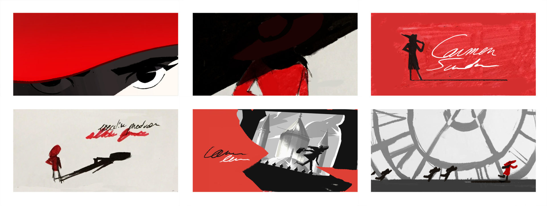
^ TITLE SEQUENCE THUMBNAILS BY MANDDY WYCKENS
DEVELOPMENTDÉVELOPPEMENTディベロップメント
Chromosphere had the privilege of creating a dynamic new opening sequence for the Carmen Sandiego series. The beautifully cinematic sequence was brought to life by directors Manddy Wyckens and Eusong Lee. The moody and graphic visuals were inspired by Manddy’s early design exploration for the series, while the kinetic energy and action were influenced by Eusong’s animation background. The blend of these two talented directors lent this sequence its signature style and mood. Manddy and Eusong shared their thoughts with us about the development of this stunning film.
MANDDY (Director): A huge part of the visual approach is due to my interest in photography and my natural affinity for dramatic lighting when taking pictures. I remember having a phase during which I’d collect a lot of black and white photographs that were very high in contrast, with a tremendous amount of black and very little white. To me, light has this wonderful ability to reshape an architectural landscape and very selectively leak through buildings, bringing attention to an isolated element – quite the storytelling tool! I quite like that, and with Carmen, the spy theme was an invitation to create a dramatic take on lighting and make it play out through a wonderful array of locations. The fact that Carmen herself has this aura of mystery and travels through the world only reinforced my feeling that this was a very appropriate visual language to use around her. The red of her clothes appeared to me as an elegant finishing touch on the whole look, anchoring it more into something modern and not just a nostalgic vintage B&W fantasy.
^ BLACK & WHITE THUMBNAIL EXPLORATIONS FOR THE SERIES BY MANDDY WYCKENS
It was a real fantasy to explore so many different vistas and suspense-filled moments. We had to pick places which had this iconic and glamourous quality you could spot in a split second, but also expand beyond it. Eusong and I both brought very different backgrounds and perspectives to the piece – I’m deeply European, and Eusong is Korean but studied and worked in the US. He chimed in on Asian locations, I chimed in on European locations, and then we researched places we didn’t know as much about but which had very singular monuments that could be easily recognisable in the collective mind. In the end, we had a lot of ideas and some of them had to be taken down, while some others took over. It was quite the casting process to narrow everything down!
^ THUMBNAILS & SKETCHES BY MANDDY WYCKENS

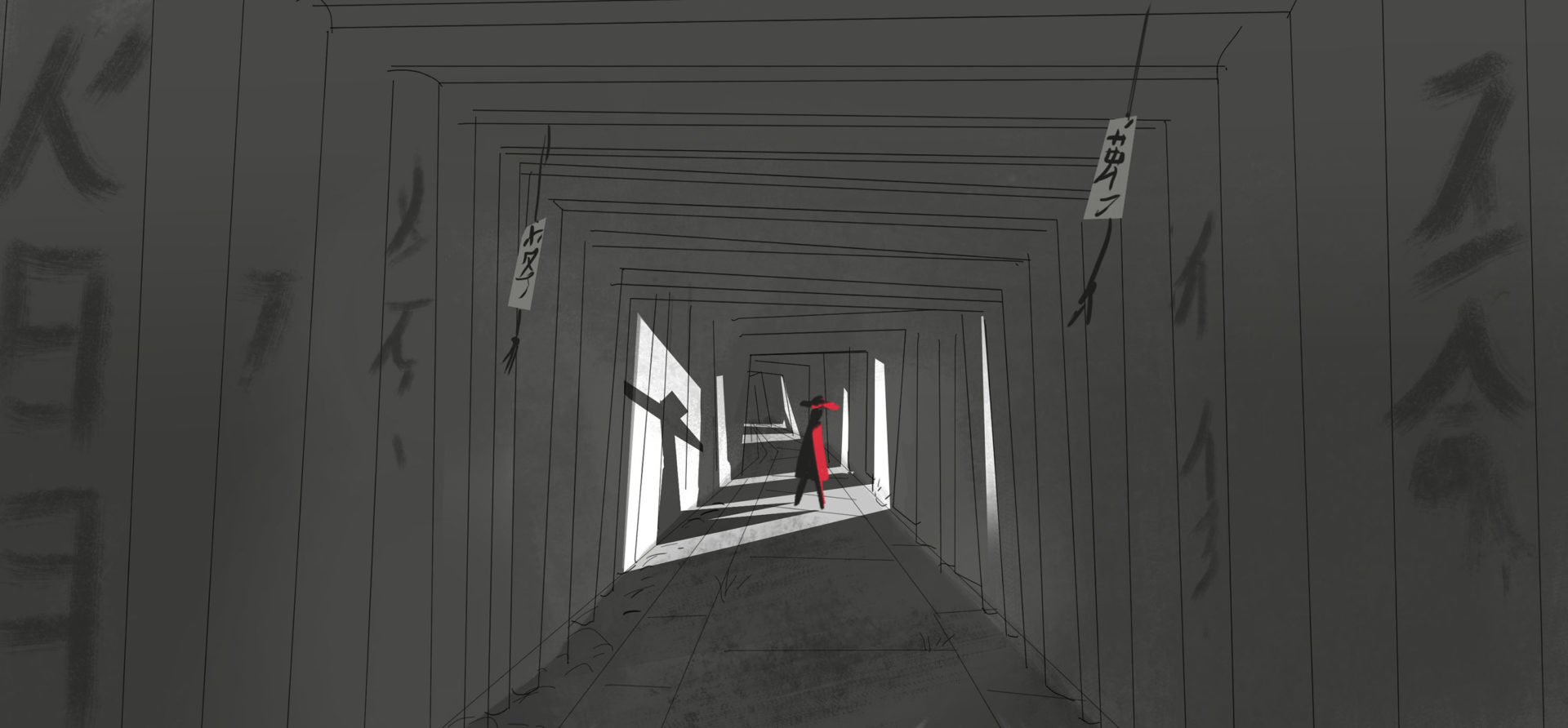
^ SHRINE SKETCH BY EUSONG LEE
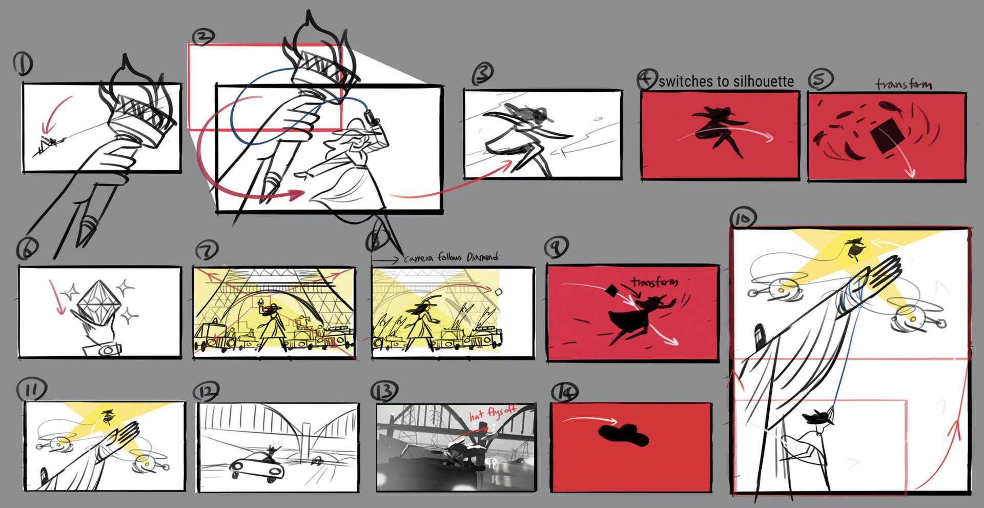
EUSONG (Director): Manddy’s B&W thumbnail keys with Carmen in red gave us a great starting point. For a spy who roams around the world in shadow, she dresses in such an eye-catching color. Those thumbnail keys were already communicating the essence of Carmen’s character. From that point, I tried to push what we could possibly do to keep that essence, and also find ways to present her in fresh and unconventional ways. The visuals could turn into very graphic and limited shapes for dynamic transitions. We also played with line-based elements from her tools or shapes of her silhouette. Eventually we concluded with a gradual progression from monotone to color along with compositions in cinematography. Then, animation and lighting naturally followed through the rules as well.

^ BEAT BOARDS BY EUSONG LEE
Carmen is a complicated character who has both mysterious and flamboyant sides. Often she lives in the shadow, giving her the nature of a spy or a vigilante. When she reveals herself in her iconic red coat and wide brim hat, her action is not only confident, but stylish too. So we focused on presenting the contrast of her qualities along with the progression of animation and cinematography – starting with disciplined and elusive movement in the B&W sequence and then rising to dynamic and skillful actions during the color sequence. I often think of such progression in a musical manner.

^ STORYBOARD THUMBNAILS BY EUSONG LEE
Eusong’s storyboard panels were combined with Manddy’s lighting keys to create this stunning animatic for the opening title sequence. Even in this early form, the cinematic scenery and dramatic moods come through, giving a clear sense of what the sequence would eventually become.
^ OPENING TITLE SEQUENCE ANIMATIC
DESIGNDESIGNデザイン
The opening sequence begins in stark and dramatic black & white, before making a dramatic transition to color. Manddy led the artistic direction and shared her thoughts on the role of design and color in the film:
MANDDY: Color is an entire dimension of design. Working with value is quite simple: it’s a vertical scale and you pick from lightest to darkest shades and then combine. Black & white Is naturally bold because it’s binary and finding a good balance is obvious. Color is a wildly different animal – it uses an arsenal of parameters like hues, values, and saturation. It really is a 3 dimensional complex object in which a strong value contrast can be supplanted by a warm/cold color opposition and you can be much more personal and subjective in your choices. It’s a hard one to navigate as you can go so many different ways.
^ TITLE SEQUENCE COLORSCRIPT BY MANDDY WYCKENS
As an artist, I handle value and light much better than color and hence my colors always rely a lot on values/contrast for appeal. It’s a sort of crutch to me: values help me navigate color. The trick is that I use my truncated approach to color as a style choice instead of a defect. I’m convinced that as soon as you make an excluding choice in design, you hold a strong stance. And with Carmen, I think I hold my partial understanding of color is used as a stylization that helps to keep a continuity between the B&W and the color.
^ CHAMPS-ÉLYSÉES BACKGROUND PAINTING BY EASTWOOD WONG
Carmen’s red coat has to obey the same rules as everything else and never be in competition with other colors or values. When the film shifts to color part way through, we still kept heavy blacks and dark values in some places to stay dramatic, and also make things more tilted, dynamic, and shifting all around so that it’s not just about adding color but also about breaking any rigidity created from the opening black & white sequence. Carmen herself shifts gears too – poised and stealthy in the beginning, but also getting into action when required to.
^ TAJ MAHAL BACKGROUND PAINTING BY SYLVIA LIU
ANIMATIONANIMATIONアニメーション
The stunning, kinetic action throughout the opening title makes this truly a world-class film. Eusong oversaw the international team of animators and made sure every detail was looked after in the process.
EUSONG: The detailed execution was possible because there was active feedback from both animators and designers. Especially in the second part of the storyboards, where it has a varied cadence of movements from scene to scene, there are certain poses she hits and stays in (relatively) longer while the overall action still feels speedy. For those moments there was a lot of effort from the design team to make sure she keeps her stylish look during the action.
^ GRAPPLING HOOK SEQUENCE ANIMATION BY MARLÈNE BEAUBE AND JONATHAN DJOB NKONDO
Because Carmen’s design is so graphic and detailed, animating her is a challenge in itself. Her design is lineless and slim, and it’s very tricky to deform her shapes to add weight and force. But our animators never held back from finding details to bring out personality and fluid movement to her clean, acrobatic poses. Her facial expressions, the way her coat blows in wind, how she holds her hat while sliding, all contributed to the overall feeling.
^ ROOFTOP SEQUENCE ANIMATION BY GERVAIS MERRYWEATHER
Animators Marlène and Gervais brought classic, smooth actions and weight with snappy timing that you get from hand-drawn animation. Tommy (Senior Animator), who is more fluent in Flash and graphic animation styles, made sure all the poses were tight and followed a clear line of action. For more technically complicated scenes like the one with Carmen holding the diamond or the hang glider shot, Natan (Animator) built all assets in After Effects to animate the characters, backgrounds, and even the lighting. This process gives him all the controls he needs to create harmonious movement in a shot. Every shot has a point the animation should convey and everyone has different strengths. We had an incredible all-star animation team on this project, also including the talents of Thea Glad, Jonathan Djob Nkondo, Kat Ruzics, Lea Justum, and Mehdi Aouichaoui – it was truly a team effort to perfect every single shot and achieve the intended impression.
COMPOSITINGCOMPOSITING基礎の構成
Chromosphere’s compositing team, lead by Stéphane Coëdel, gave the sequence its final cinematic look. The compositing process takes the painterly lighting effects from the backgrounds and brings them to life, cutting through the environments and creating sharp, dramatic pools of light, and setting the characters in space.
^ TITLE SEQUENCE COMPOSITING BREAKDOWN VIDEO
^ CARMEN SANDIEGO DEVELOPMENT SKETCHES BY KEIKO MURAYAMA
PRODUCTION DESIGNDIRECTION ARTISTIQUEプロダクションデザイン
Chromosphere’s journey with Carmen Sandiego began in 2016 when we were asked to pitch a visual direction for the new series by Executive Producers Duane Capizzi and Caroline Fraser. To create the initial pitch, we put together what would become our core team of design leads: Lead Character Designer Keiko Murayama and Art Directors Sylvia Liu and Eastwood Wong.
KEIKO (Lead Character Designer): I clearly remember I was grocery shopping at Marukai Market when Kevin (Creative Director at Chromosphere) texted me asking if I would be interested in doing character design for Carmen Sandiego. I got to work on Carmen starting with the pitch. First, I tried to design characters based on the original design, which morphed into a new modern look. Then I tried a more cartoony version, but ultimately the show was going for realistic proportions, so the design evolved into something between cartoony and realistic, yet still graphic.
^ CARMEN SANDIEGO DEVELOPMENT SKETCHES BY KEIKO MURAYAMA
SYLVIA (Art Director): I was very excited to work on Carmen and create our own take because I was familiar with the game and TV show when I was growing up. I remember she was really cool and traveled to many different locations all over the world so I think that’s a fun opportunity design-wise. We wanted to make sure Carmen, the other characters, and all the locations were specific and that you could visually tell where you were every episode. We also wanted to have a colorful & fun world but still keep it sleek and spy-like.
EASTWOOD (Art Director): It was very exciting to work on a property like Carmen – I remember her being such a glamorous badass thief and immediately was drawn to her world traveling espionage adventures with her iconic, signature red coat. We had a vision of truly modernizing the aesthetic and world of it. We knew she would be traveling to places old and new, and we had lots of exciting opportunities to play with that and bring a lot of influences from fashion, graphic design and anime.
^ CARMEN SANDIEGO DEVELOPMENT SKETCHES BY KEIKO MURAYAMA
KEIKO: Powerful women come in different colors and shapes. A question I asked myself was how was I going to represent/recreate a powerful woman on paper? So I envisioned her with strong eye power, starting with her signature expression – mischievous, and strong willed.
^ CARMEN SANDIEGO DEVELOPMENT POSTER BY KEVIN DART & KEIKO MURAYAMA
SYLVIA: We wanted to have a modern but classic action/espionage feeling so there’s a lot of sharp graphic shapes and silhouettes, and retro travel poster-inspired compositions with more dramatic lighting and perspective. We also had some Japanese anime influence growing up so there’s a little of that in some of the lighting and shot designs.
EASTWOOD: For the look of Carmen’s world we wanted to make sure to give each of her travel destinations a distinct look and color palette while keeping true to the local cultures, and that is reflected in our colorscript process. Overall we wanted the show to look sleek and modern to fit the action aspect, but also be conscious of its emotional moments, and we achieved that with our execution in lighting.

^ STYLE FRAMES BY EASTWOOD WONG AND SYLVIA LIU. CHARACTERS DESIGNED BY KEIKO MURAYAMA
We were extremely fortunate to secure the job to design the entire series, and over the years Carmen became a central part of our lives and the studio. Carmen’s adventures allowed us to design locations all around the world, and the design process itself was truly a globally collaborative adventure. Our leads shared some of their thoughts looking back on the journey.
ELAINE (Art Director): I think the world of Carmen has a specific style balancing graphic shapes and atmospheric lighting with a level of detail that makes a setting actually feel like its respective location.
I remember early on, I got one note from art director Sylvia Liu about how my first pass on a background had a particular type of door handle that didn’t seem to exactly fit its setting. I think that was one of the points where I appreciated every detail I could catch in all the locations the show led us to. All cities and places have their iconic and usually grand settings, but I also had a lot of fun identifying all the little things and then seeing how they differ from each location to the next.
And then of course, it’s a whole other exciting process to completely tie in all the elements and call a painting finished. I think that all the environments have this beautifully adventurous mood to them that make it fit the story of Carmen so well. I learned that art director Eastwood Wong can make any place feel magical, and it was always a grand feeling putting that extra care in areas that needed more life in order to sell lighting and color to their full potential.

^ VILE ISLAND DESIGNS BY EUSONG LEE
EASTWOOD: Looking back, Carmen’s colorscript process was challenging and rewarding for me in many ways. The color panels are abundant and the deadlines were tight as in any TV production, but it really proved to be a useful tool in the production process where directors and artists can all reference the colorscript throughout the entire pipeline, therefore helping to create a consistent language for the entire show.
SYLVIA: It was also a design heavy show since every location was changing every episode, so we tried to help out the team through that process by doing colorscripts. The first season was a big learning process, which is normal when starting a completely new style for an existing title. The storytelling became more dynamic throughout the series, and so did the shots, so in the second season we learned to have more people focused on layout which was a big help to our BG painters.
^ SEASONS 1 & 2 COLORSCRIPTS BY EASTWOOD WONG AND SYLVIA LIU
ELAINE: I really enjoyed the variety of exploring whole new worlds in each episode. I think my favorite moment might be at the end of season 1, when Carmen decides to take the full initiative to uncover her past and discover herself. All the while looking over the rooftops of Poiters, France. How cool is she? (I also made myself a popstar in one of the Japan backgrounds. 🙂 Can you find it?)
KEIKO: I learned a lot from the production. There weren’t many design changes from the pre-production to the production, but I quickly learned that I needed to be very focused on the technical aspects of the design. Unlike previous shows I had worked on, there was no room to cheat the design for animation.
^ VARIOUS SERIES BACKGROUNDS CREATED BY THE CHROMOSPHERE DESIGN TEAM
SYLVIA: The design team was amazing and it was definitely a new challenge for most of us in that time frame but we learned a lot. Keiko, our character supervisor, designed nice graphic characters with slightly realistic/action-looking proportions that matched the show’s style so well, but it was also a very rare and difficult combination of styles to achieve. So the character designers who worked with Keiko, such as Jojo, Mayumi, Julien, and more made a huge difference in the show and kept the style going until the end.
Our background and prop team, both in-house and elsewhere, all contributed so much to the show. The show was very design-heavy, so all the artists we worked with were very skilled in both layout/design and painting/color. All the artists were so helpful and amazing during our first season learning process, so I’m very grateful for that. We also got to meet a lot of great people around the world so that was nice 🙂
EASTWOOD: Working with all the artists at Chromosphere and around the world was very inspiring and humbling. Even as art directors on this project we welcome artist’s inputs to further enrich the show. I am immensely proud of the show and we would not have been able to execute the show’s quality and finesse without the huge talent and contribution of everyone, from the character artists, BG painters, prop designers, compositors, and the incredible partners at Wild Brain.
^ CARMEN SANDIEGO BOOK COVERS BY ELAINE LEE
MARKETINGMARKETINGマーケティング
In addition to our work on the series, Chromosphere has also had the great opportunity to be involved in a range of marketing work for Carmen Sandiego, including a series of books for which Elaine art directed the covers.
ELAINE: Sketching up scenes with Carmen in the picture was a super fun change of pace! The covers required story elements from the books themselves, so I was able to incorporate a range of different dynamic energies into each idea.

^ BOOK COVER THUMBNAILS BY ELAINE LEE
Based on the prompts given, I was also able to loosely sketch with composition and color, and focus more on the clarity of ideas, which in itself was another change of pace considering I had to go straight into cleaned finals for the show elements. I also had to be mindful of some other restrictions like the text space, logos, and making sure Carmen’s face was easily seen in each sketch while still depicting the ideas. I learned a lot about making sure those restrictions and each story element felt like they all visually fit with each other in order to create a properly suiting cover for the books.

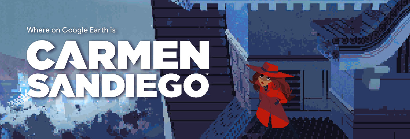
^ WHERE ON GOOGLE EARTH IS CARMEN SANDIEGO BANNER FROM GOOGLE
Another exciting project outside the series came from an exciting collaboration with Google to create character art for “Where on Google Earth is Carmen Sandiego?”. Keiko again worked on this project as Lead Character Designer, and Designer Linda Fong colored all of the characters.
KEIKO: That was a really fun project. The amount of the characters for the project was a lot, but it wasn’t a struggle at all. I think it’s very important for character designers to research what you are designing, because nothing is better than studying real people. I do research on people in the country/profession, and use them as references.
^ WHERE ON GOOGLE EARTH IS CARMEN SANDEIGO CHARACTERS BY KEIKO MURAYAMA AND LINDA FONG
^ LINDA FONG AND KEIKO MURAYAMA WORKING ON THE DESIGNS FOR WHERE ON GOOGLE EARTH IS CARMEN SANDIEGO
For a social media promotion, Keiko demonstrated and recorded her design process for Carmen, showing her detailed and artful approach to drawing the stylish thief!
^ CARMEN SANDIEGO DRAWING PROCESS BY KEIKO MURAYAMA
PRODUCTION CREDITSCRÉDITSクレジット
TITLE SEQUENCE
DIRECTED BY
Eusong Lee & Manddy Wyckens
DESIGN
Eastwood Wong
Sylvia Liu
Elaine Lee
Keiko Murayama
Linda Fong
ANIMATION
Thea Glad
Jonathan Djob Nkondo
Natan Moura
Marlène Beaube
Kat Ruzics
Gervais Merryweather
Lea Justum
Tommy Rodricks
Mehdi Aouichaoui
COMPOSITING
Stéphane Coëdel
Rob Ward
MUSIC
Jared Lee Gosselin
Raquel Castro (Performer)
Ray De La Garza (Consultant)
SPECIAL THANKS
Duane Capizzi
Caroline Fraser
Netflix
DHX
HMH
SERIES PRODUCTION DESIGN
ART DIRECTOR
Sylvia Liu
Eastwood Wong
LEAD CHARACTER DESIGN
Keiko Murayama
CREATIVE COMPOSITOR
Stéphane Coëdel
BACKGROUND PAINTER
Elaine Lee
Heejin Park
Paul Tuo Tsui
Lauren Zurcher
Michelle Kwon
Janine Chang
Michelle Park
Arthur Chaumay
Wendy Park
Charles Hilton
CHARACTER DESIGN
Julien Perron
Jojo Park
Brayden Kowalczuk
Gyimah Gariba
Mayumi Nose
Glenn Wai Lim Wong
Gang Maria Yi
Jason McLean
Jane Schneider
COLOR STYLIST
Linda Fong
Xanthe Bouma
Jessie Wong
PROP / EFFECT DESIGN
Emily Paik
Junyi Wu
Jenny Yu
COMPOSITOR
Sol Lee
ADDITIONAL DESIGNS
Jesse Aclin
Eusong Lee
Marion Bordeyne
Eva Eskelinien
PRODUCTION COORDINATOR
Bryan Wolfson
DIRECTOR OF PRODUCTION
Myles Shioda
CREATIVE DIRECTOR
Kevin Dart
