Case Study4B
© COPYRIGHT MMXIX CARTOON NETWORK. ALL RIGHTS RESERVED.

2D ANIMATION / 2019
PROJECT OVERVIEWRÉSUMÉ DU PROJETプロジェクト概要
Chromosphere and our extended family of artists have been fortunate to be a part of Cartoon Network’s Steven Universe franchise since the show started in 2013. Because of this long history, when we were asked to design, animate, and composite the opening sequences for the Steven Universe movie, we were beyond honored and wanted to make sure that we create something beautiful enough to introduce this chapter in Rebecca Sugar’s vision.
In close collaboration with Rebecca, we visualized a series of vistas emblematic to Steven’s story. The second sequence, boarded by Hillary Florido, had us bring a storybook style introduction and series recap to the screen in a way that both honors Steven’s history and harkens back to classic fairytales.
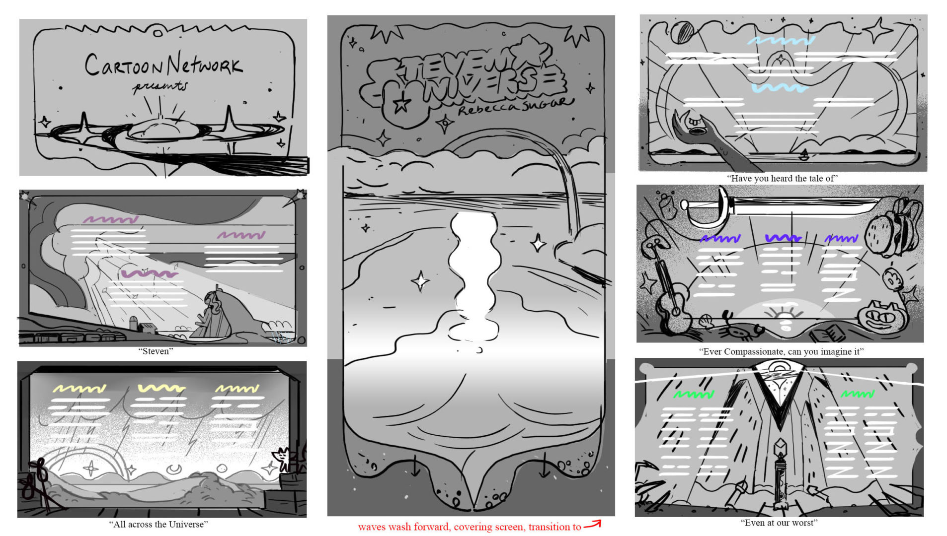
^ BLACK & WHITE THUMBNAILS FOR THE OPENING CREDIT SEQUENCE BY ELLE MICHALKA
DESIGNDESIGNデザイン
The opening title sequence of the movie features gorgeous vistas from the long story arc of Steven Universe. Designer Elle Michalka, a former Art Director for the TV show, created the beautiful scenery and sumptuous color palettes that defined the sequence. She shared her thoughts with us on the beginning of the process:
ELLE: I have to say that Rebecca is the mastermind behind it all, she had a really clear vision and I just wanted to close up the gaps between what she had already figured out. She explained which locations she wanted to go with which parts of the song, and that she really wanted to emphasize the familiarity of Beach City against the strangeness of outer space. That theme was one of the earliest things Rebecca and I talked about on the show and I find it particularly inspiring. It’s that little bit of strangeness that disrupts our sense of what we think cartoons should be and keeps us engaged to see what could be coming.
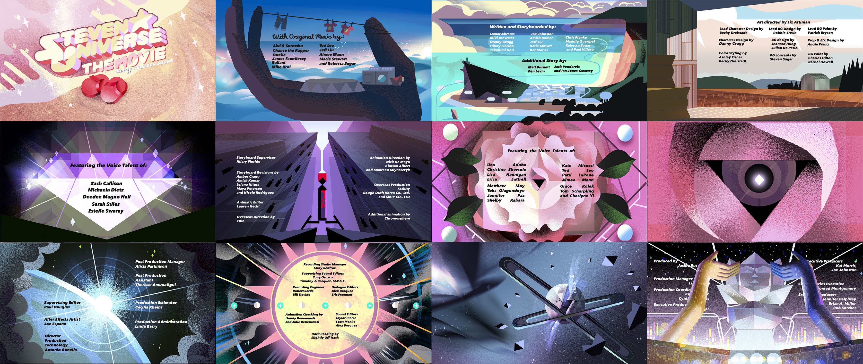
^ OPENING CREDIT SEQUENCE COLORSCRIPT BY ELLE MICHALKA
Color has been a huge part of defining the storytelling and atmosphere of Steven Universe since the show began. Elle shared her thoughts on the use of color in the title sequence:
ELLE: Color is huge! Even standard SU earth colors have a bit of electricity in them but I tried to push more digital neons at the end. For lighting, it follows the story, so we used a lot of warm, bright colors in the beginning and cool, darker colors at the end. I think I had initially made the closeup shot of the Temple hand a dusk palette which was pretty on its own, but we eventually had to change it to daylight to fit it in with the sequence.
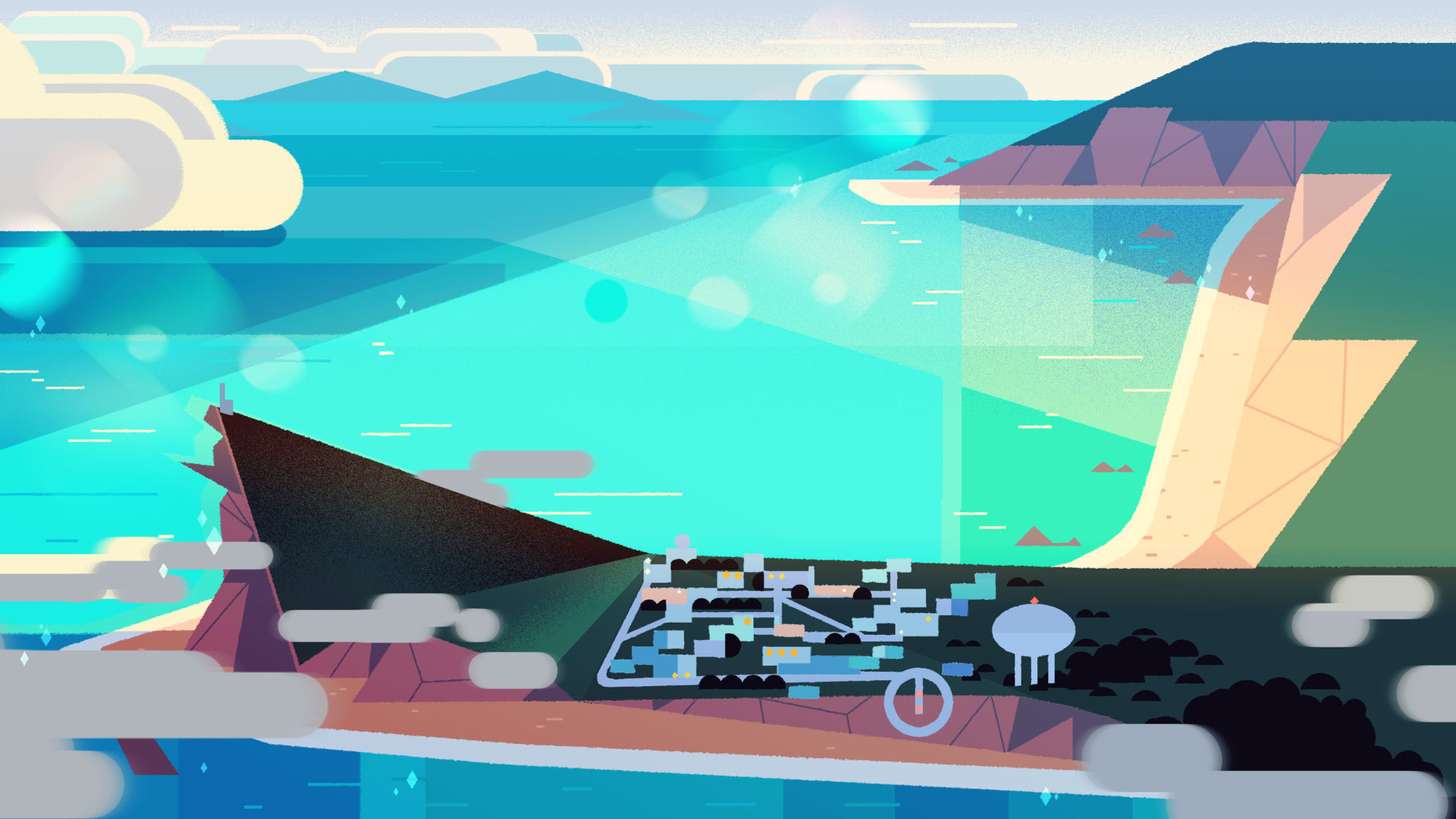
^ BEACH CITY VISTA PAINTING BY ELLE MICHALKA & JASMIN LAI
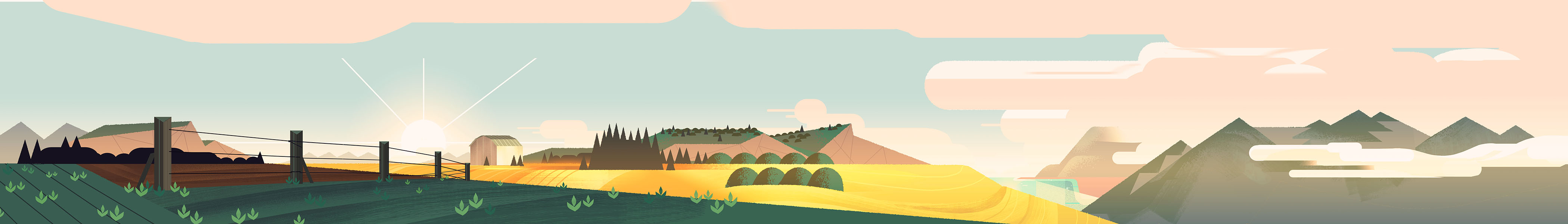
^ COUNTRYSIDE PANORAMA PAINTING BY ELLE MICHALKA
It was important for the images to showcase the names of our talent so I was really just thinking about them as frames. I think my approach was similar to what I did in “The Answer” episode, but this time I was able to be really bold with the compositions. My very first pass was a little too bold and looked too close to the following storybook sequence, so I had to find a cinematic balance. I tried to really lean into the graphic sensibility that Kevin (Dart) brought to the show early on. I’m always trying to keep up with the work you guys are doing at Chromosphere, you guys are definitely my biggest inspiration!
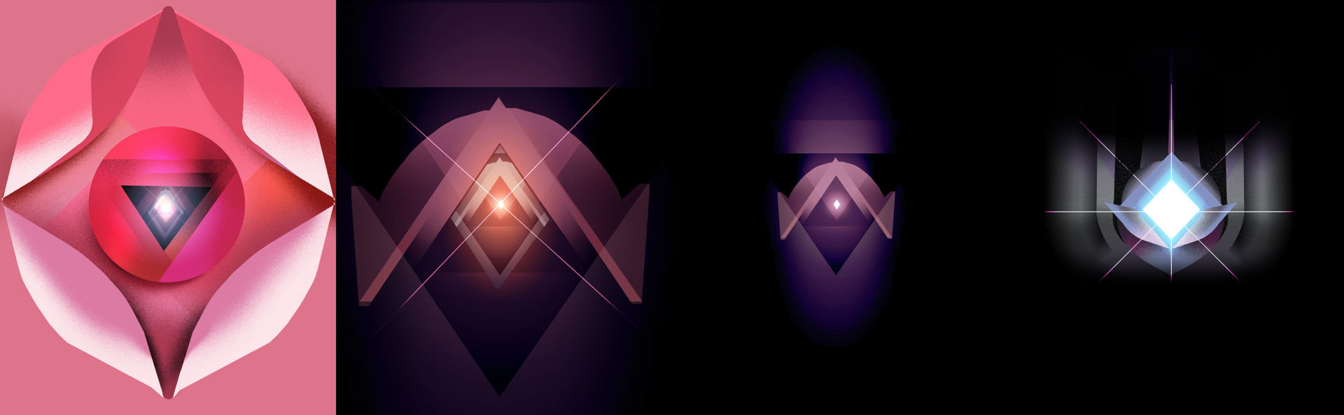
^ STAGES OF THE ROSE TRANSITION BY ELLE MICHALKA
The rose transition from earth to outer-space was Rebecca’s idea but I really loved getting to flesh it out. For me abstraction is about finding a metaphor. I guess I pictured the transition as a “birth in reverse” and wanted to feel like I was flying through some kind of extra-dimensional temple. I imagined the space as a threshold that takes you from the very small to the very big.
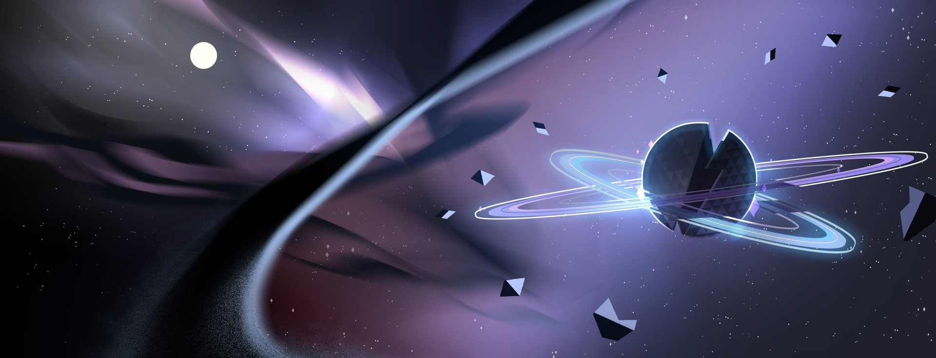
^ HOMEWORLD PAINTING BY ELLE MICHALKA & JASMIN LAI
ANIMATIONANIMATIONアニメーション
This opening title sequence plays out like a classic Disney movie opening, but with modern and sophisticated visuals. Our lead compositor Stéphane Coëdel shared his thoughts on how the sequence was brought to life in animation:
STÉPHANE: Like most projects I work on, I always spend quite some time watching the animatic and analyzing the visuals produced by the design team. I go through the files, open them and study how they’re laid out, and what style of brushes and effects are used. Then I start trying to figure out how to translate the artists’ vision into animation without compromising too much on the way they treated the pictures.
In the case of Steven Universe movie opening, what was interesting was to find a way in After Effects to make these quite stylized curtains, wave shines, and highlights move in a convincing way while preserving the grainy look and geometrical design, as well as bringing a sense of depth.
^ WAVE ANIMATION PROCESS BY STÉPHANE CÖEDEL
For the wave on the beach, Tommy, our lead animator, had a first pass at trying to animate it traditionally, but it was quite difficult with that approach to stick to the very geometric look that Elle & Jasmin had created. So I proposed to use the « Shape » tool with basic round corner rectangles moving like the wave would move on the sand. Then we blurred the whole shape and tightened the alpha level to get sharp edges while turning all of the corners into curves.
For the curtains I had basically to rebuild all the shapes and shades using the « Shape » tool. I adjusted the feathering of these shapes to match the original design. I then used the effect called « Reshape » combined with « Mesh Warp » and animated the opening. At the end I used the « Noise Alpha » to get the stylized grainy look. I also changed the blending mode of some layers to « Dissolve ».
^ STEVEN UNIVERSE OPENING SEQUENCE COMPOSITING PROCESS REEL
Animator Natan Moura handled some of the most technically complex elements of the title sequence, such as the 3D storybook. He described some of his process for creating these 3D elements:
NATAN: I ended up building and rigging the 3D book directly in After Effects instead of a more traditional 3D app. There is much less 3D functionality in After Effects but it can be easier to incorporate 2D elements. It was a bit easier to achieve some of the 2D style highlights on the book pages and allowed me to quickly break up the 2D background into smaller parts to create a 3D version of it. Scenes like this can definitely get a bit heavy to work with in After Effects, so you have to be careful!
For the movie’s teaser, we had to create a spinning 3D heart gem. I decided to use Blender for the 3D part. I made the gem super reflective and placed it inside a giant sphere that was colored with some abstract patterns created by the design team. As the gem turned, it’s many-angled faces would reflect different parts of the sphere’s colored pattern. This created a satisfying shimmering effect while still giving me control over the colors on the gem. I then placed the flat images of the characters behind the gem so they only appeared clearly when the flat middle face of the gem was facing the camera. I had to make the gem transparent rather than reflective to render this part, otherwise, the characters would not be visible through the gem! Once all the layers were put together in After Effects, Stephane added some final touches like the glows and some extra warping on the characters to enhance the feeling that they’re refracting through a gem.
^ “STEVEN UNIVERSE: THE MOVIE” TEASER ANIMATED BY NATAN MOURA, COMPOSITED BY STÉPHANE CÖEDEL, DESIGNED BY JASMIN LAI
MARKETINGMARKETINGマーケティング
Chromosphere has had the honor of designing album covers, DVD packaging, and other marketing materials for Steven Universe for several years. All of these have been guided by our Art Director Jasmin Lai (also a former Art Director for the TV show). She shared some insights into these projects and the overall design process:
JASMIN: I really enjoyed making the album covers for Steven Universe Vol. 2 and Karaoke. Working with Rebecca and the team at CN is always quite enjoyable because they’re always willing to give us a lot of creative freedom. It was super fun getting to paint some of my favorite simple moments in the show, which are often just Steven hanging out with his friends and family, happily sharing time together.
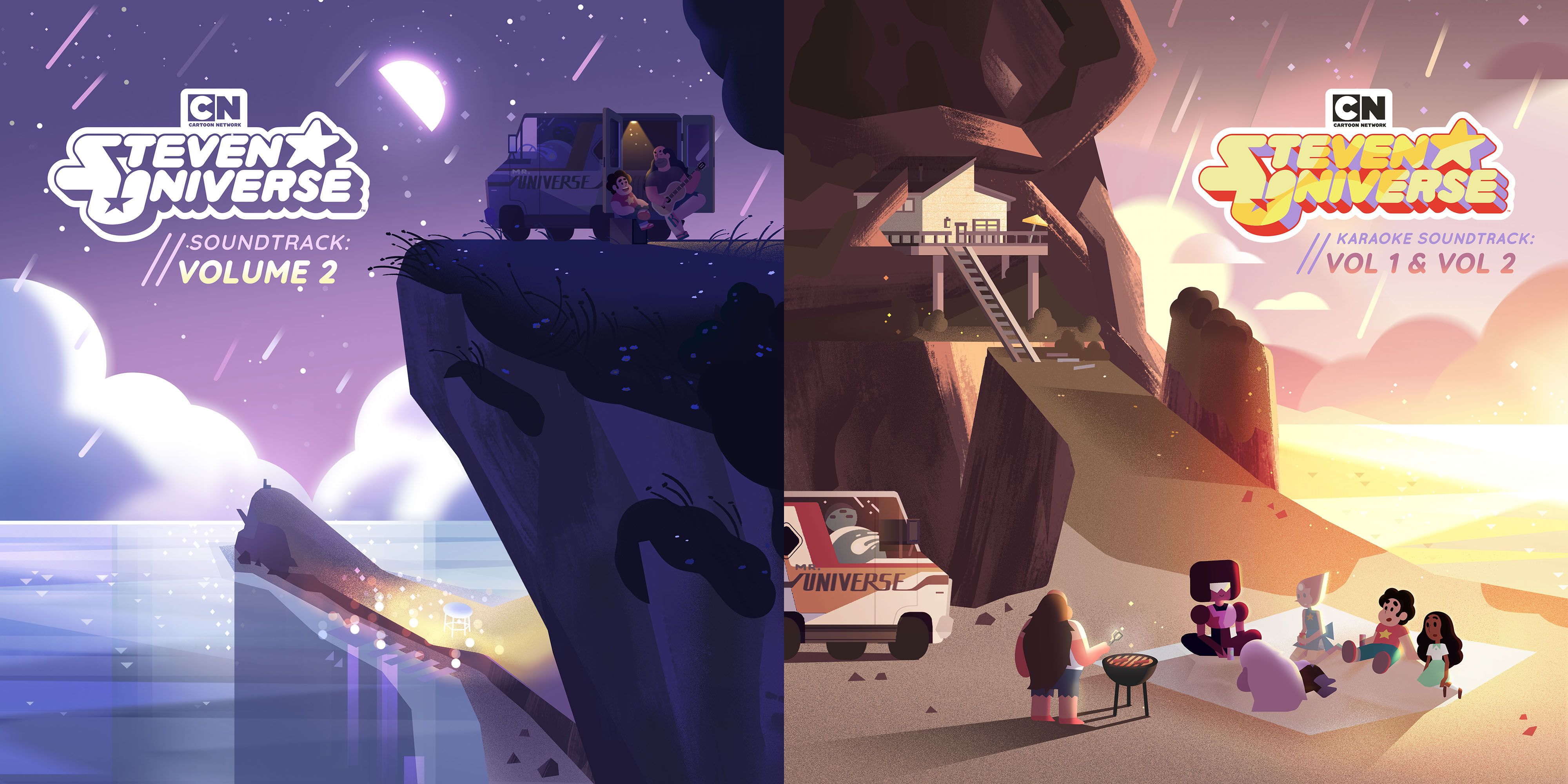
^ STEVEN UNIVERSE VOLUME 2 & KARAOKE ALBUM COVERS BY JASMIN LAI
My general design approach to these was initially inspired by the show’s opening title and ending cards. The shapes and colors are still true to the show, but the main difference is that there are no outlines defining volumes. It feels like the same world, just a more ambient one, and it relies on the clarity of silhouettes and graphic design elements to tell the story. I like to use this approach because it allows me to play with more depth and dimension of shapes, and it also helps me create simple and smooth color palettes.
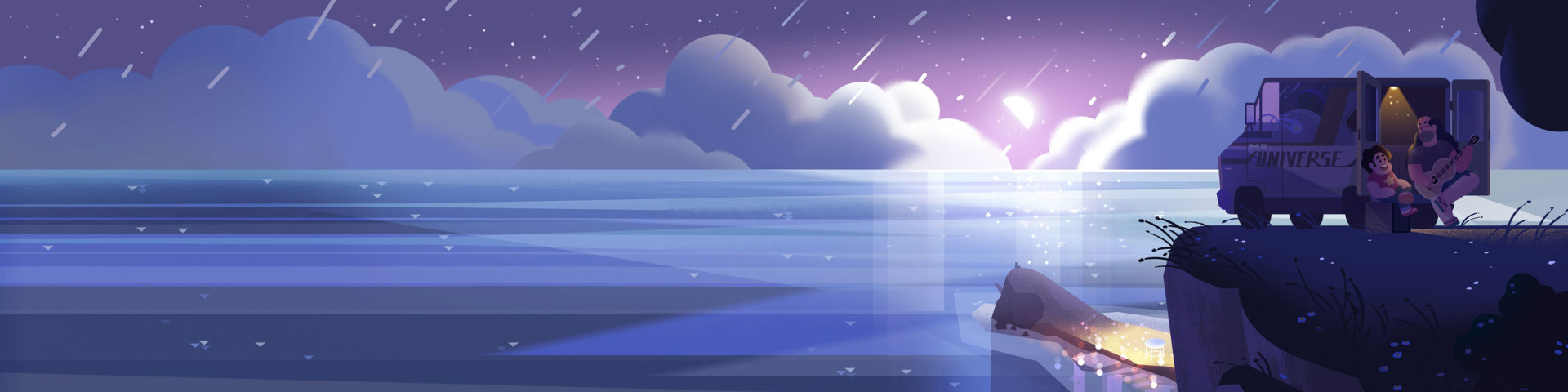
^ STEVEN UNIVERSE VOLUME 2 SOUNDTRACK BANNER IMAGE BY JASMIN LAI
I often used the rounded pill shape and blocky diamond shape, which are prominent throughout the Steven Universe show aesthetic, and I would also use the same desaturated tones and blinding highlights that make up so much of the show’s aesthetic as well.
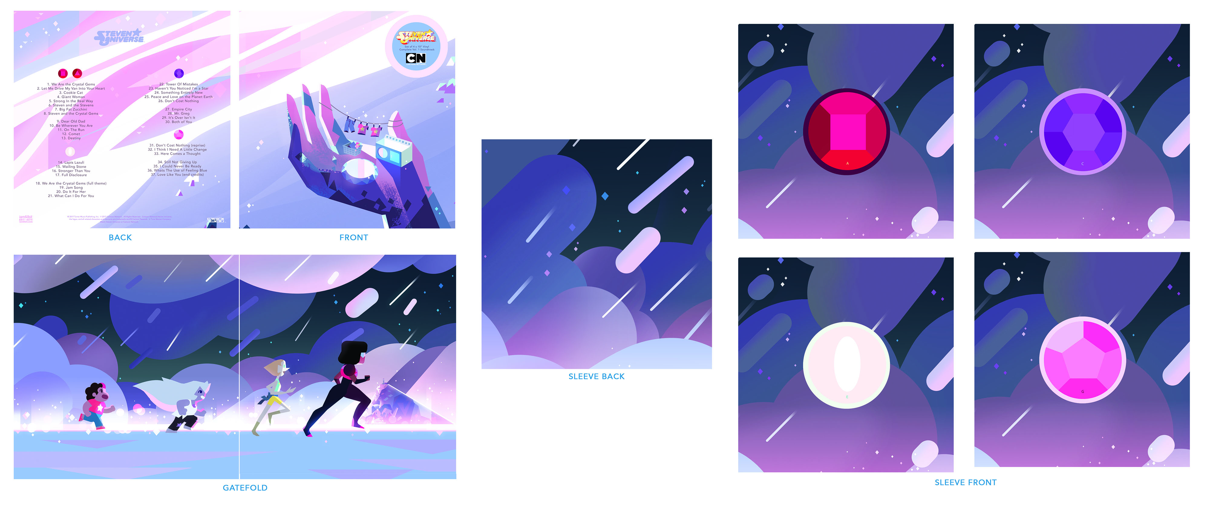
^ STEVEN UNIVERSE LP SOUNDTRACK PACKAGING BY JASMIN LAI
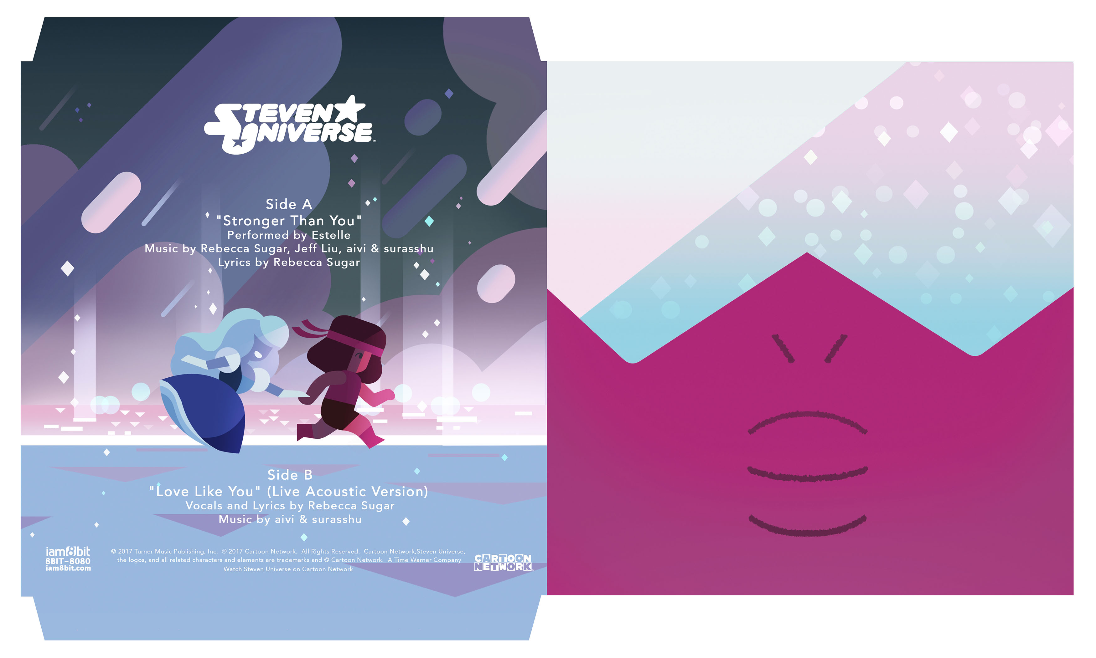
^ “STRONGER THAN YOU” EP PACKAGING BY JASMIN LAI
PRODUCTION CREDITSCRÉDITSクレジット
OPENING SEQUENCE DIRECTED BY
Rebecca Sugar
VISUALIZED BY
Chromosphere
STORYBOOK SEQUENCE BOARDED BY
Hilary Florido
DESIGN
Elle Michalka
Jasmin Lai
ANIMATION
Tommy Rodricks
COMPOSITING
Stéphane Coëdel
Natan Moura
PRODUCTION COORDINATOR
Bryan Wolfson
PRODUCER
Sarah Kambara
DIRECTOR OF PRODUCTION
Myles Shioda
CREATIVE DIRECTOR
Kevin Dart
STEVEN UNIVERSE MOVIE TEASER
Jasmin Lai
Eusong Lee
Natan Moura
Stéphane Coëdel
ALBUM COVER DESIGNS BY
Jasmin Lai