Case Study3A
© COPYRIGHT MMXVIII GOOGLE SPOTLIGHT STORIES. ALL RIGHTS RESERVED.

VIRTUAL REALITY / INTERACTIVE / 2018
PROJECT OVERVIEWRÉSUMÉ DU PROJETプロジェクト概要
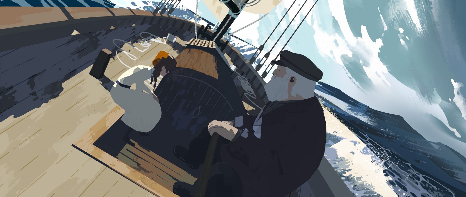
Age of Sail is a VR short film directed by John Kahrs. Set on the Atlantic Ocean, the story focuses on an old pilot cutter captain from the age of sail who is feeling outrun by the steamship era. He relearns his when he rescues a young girl who has fallen overboard from a passing ship. The sprawling experience takes place on a vast ocean brought to life in a unique 3D style.
This project gave us another chance to work with John Kahrs, who we had previously worked with on June, as well as the Google Spotlight Stories team who we had previously worked with on Sonaria. We took on the task of designing the entire film, building the assets, character animation, effects, and even the dynamics of the whole ocean. We did this all with support from and in close collaboration with the GSS team as well as Evil Eye Pictures.
DEVELOPMENTDÉVELOPPEMENTディベロップメント
KEVIN: When John first brought this project to us he wasn’t sure it would be the right fit for our studio stylistically. However it was very attractive to us, particularly because of the style being outside of our normal wheelhouse. It also seemed set up to tackle a lot of conventional wisdom about VR head-on, like the idea that you shouldn’t put someone in a headset on a live, rocking ocean. The fact that it was trying so many new things and would test the abilities of our team made it a perfect project for us.
John had a fair amount of sailing experience, so a driving goal from early on was that the experience of sailing in this film needed to feel authentic. One of the artists we referenced from early on was Thomas Hoyne because of the way he was able to capture the raw feeling of being out on the open ocean. The boats in his paintings almost look like living creatures because of how they are posed so dynamically, with the dramatic lighting accentuating the curved sails.
While Hoyne’s paintings are full of exciting detail, we also looked at Bernie Fuchs because of his method of painting which is equally dynamic but obscures a lot more detail. Due to the real-time limitations of the project, we looked for lots of lessons in design economy within his paintings.
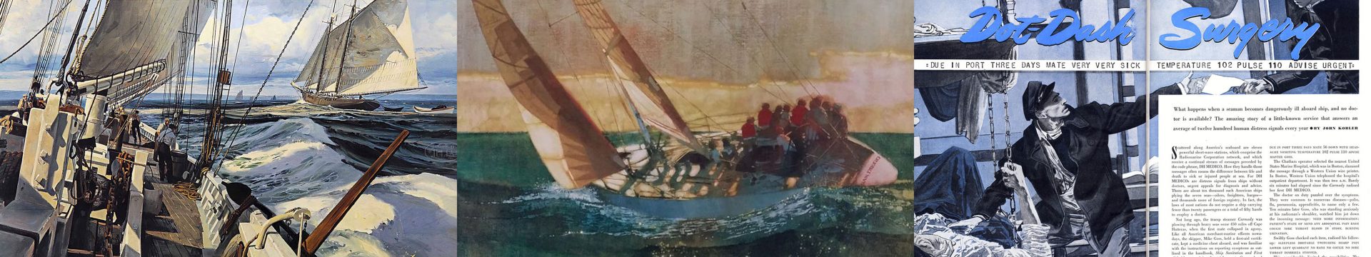
^ VISUAL INSPIRATION FOR THE PROJECT / THOMAS HOYNE, BERNIE FUCHS, ROBERT FAWCETT
Those early discussions led me to thinking of Celine Desrumaux. Her work does a great job of bridging the worlds of realistic traditional painting with graphic stylization. When she came onto the project she quickly found an appropriate color palette for the world. One of the first paintings she did beautifully captured Avery alone on his boat sailing into a blue void, with this churning, angular sea foam around him. This painting became an early atmospheric benchmark for us. From here we could keep in mind the feeling we wanted to capture as we dug into the work of designing the water, the sky, and every element of the film!
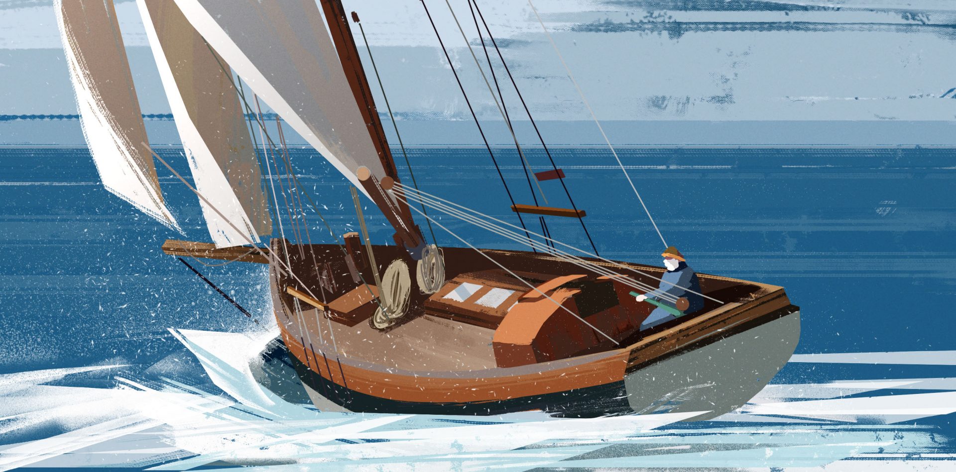
^ EARLY CONCEPT IMAGE BY CELINE DESRUMAUX
CELINE: I was really excited to join the project. I knew VR would be a challenge, as it would impose both technical and artistic constraints on us, especially as the movie was happening on a sailboat on an open ocean. We needed to think of everything in 360 degrees, including animation, design and lighting.
We all wanted something creative and colorful, but also something that immersed the viewer with the feeling of being on a boat. When you look closely at both the Hoyne and Fuchs references, there are some similarities in how the light is very bright without any detail, but also how the textures give definition to the darkness and shadows. We were aiming for the right balance between realism and illustration, with the realism coming mostly from the lighting approach and the limited color palette.
I spent the first week exploring the universe of sailing. With basic shape and backgrounds, I played with moods and colors on a unique thumbnail with a limited palette. During that week I came up with an image that really spoke to Kevin and John, and it was the starting point of this adventure.
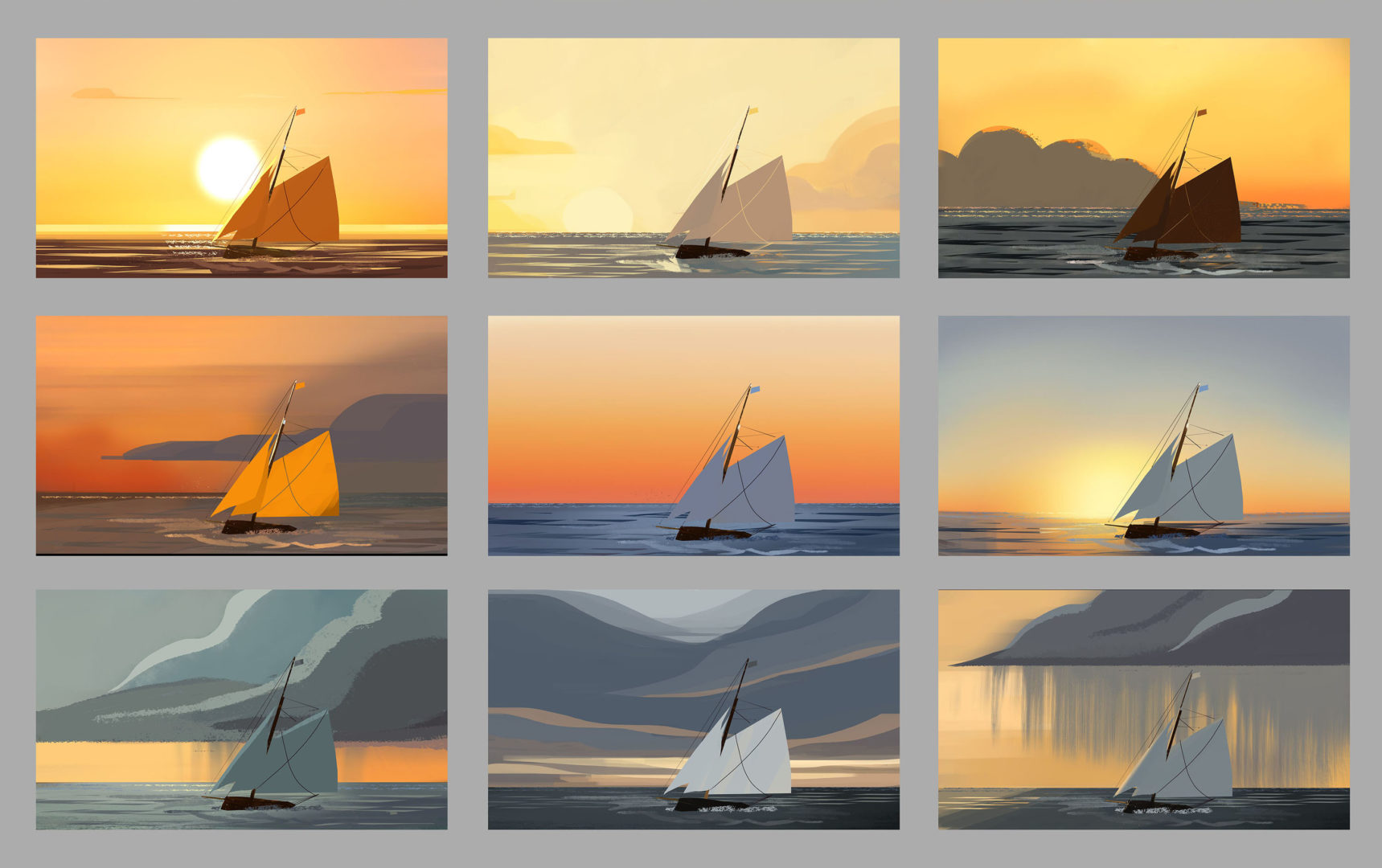
^ LIGHTING KEYS BY CELINE DESRUMAUX
DESIGNDESIGNデザイン
THE LIGHTING
JASMIN: This was the first time any of us had attempted a style like this, so our approach required a lot of exploration up front. We wanted to figure out how to translate more traditional paintings techniques into VR with a graphic twist, and make it more streamlined to be easier for animation.
CELINE: It was really important to me that the lighting support the story and the drama as much as possible. There are so many shades of colors in a sunrise or a sunset, and a beautiful intensity of the noon lighting. But we had a limited color palette to play with, and our lighting needed to be strong, efficient, immersive and beautiful.
For technical reasons, we had the constraint of using only one light to cast shadows. It pushed us to be even more efficient in our choice of lighting. It made us ask ourselves, “What is the most important thing that is happening in the scene? How can we guide the audience to look in the right direction but also support the dialogue and action?”
^ LIGHTBOARD IMAGES BY CELINE DESRUMAUX
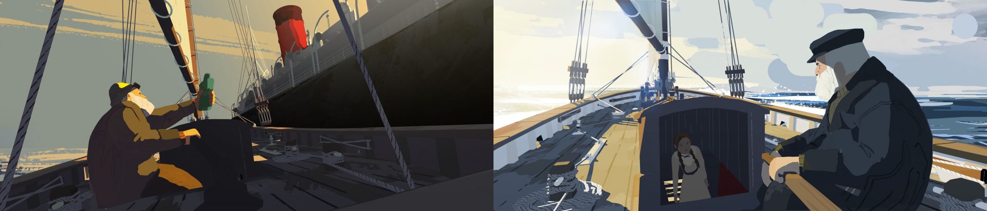
I did a light-board with 1-2 images per sequence then tested them in 3D. We needed to be extra precise with the position of our light. We were choosing carefully where to put the shadows, and we always asked ourselves how it would improve the scene to put the light where we did. The second sequence begins with Avery in total shadow cast by the huge steamship next to him in order to emphasize the feeling of him being eclipsed by these gigantic boats.
One of my favorite moments is when the beam hits Avery, knocking him to his knees, and Lara switches sides on the boat, moving out of the light and into the shadows. The contrasted lighting accentuates the confrontation between the two characters.
^ STYLEFRAME BY JASMIN LAI
THE BOAT
CELINE: We had two main characters, a sailboat, an ocean and a sky. Those five elements were all very important to tell the story and feel immersed in the experience.
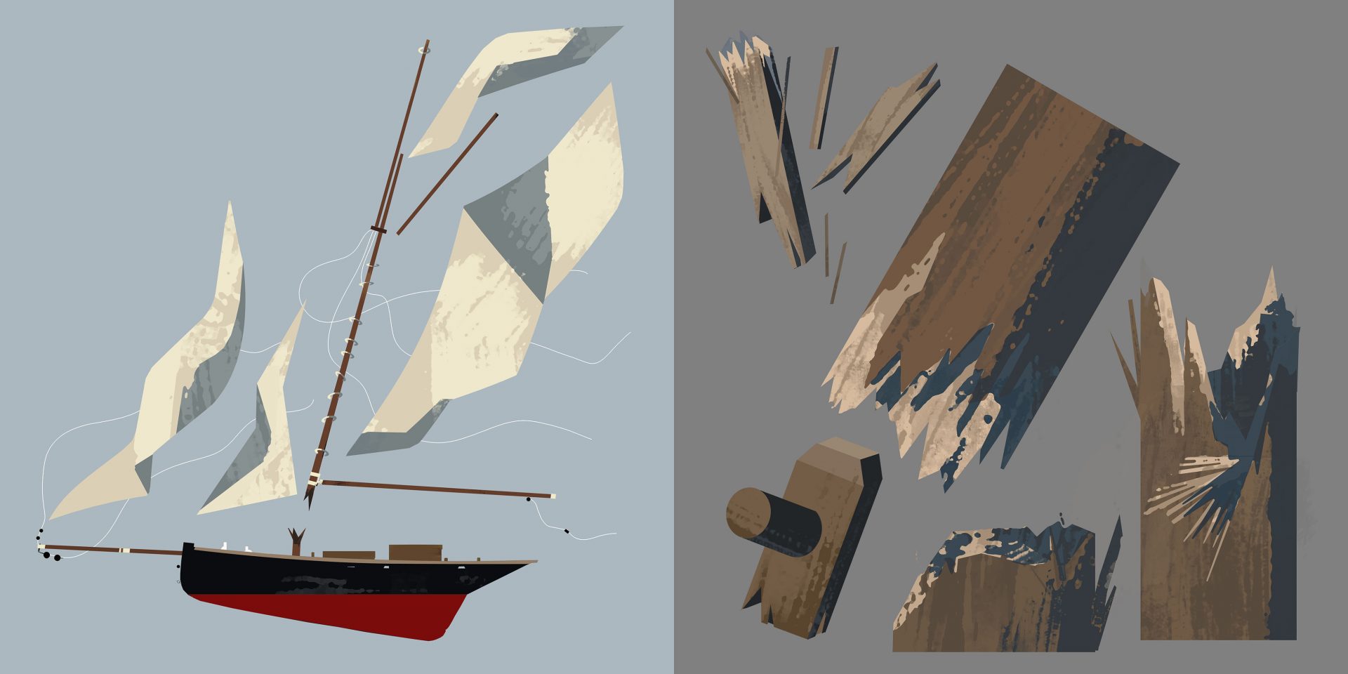
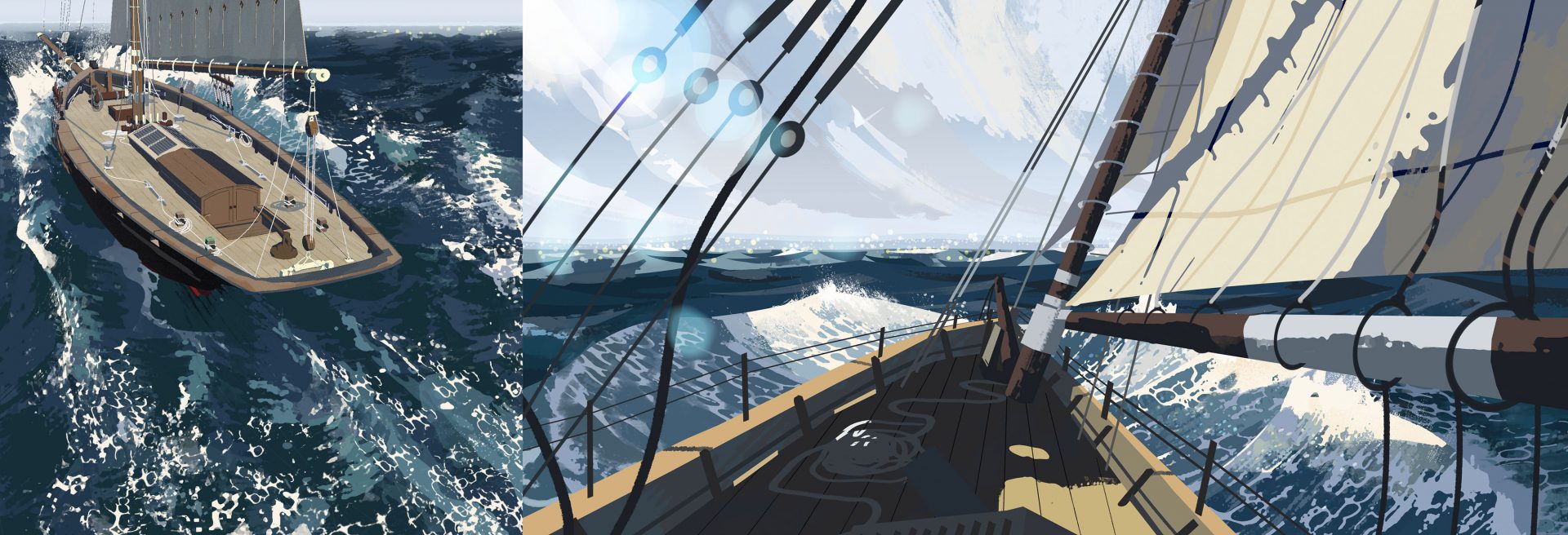
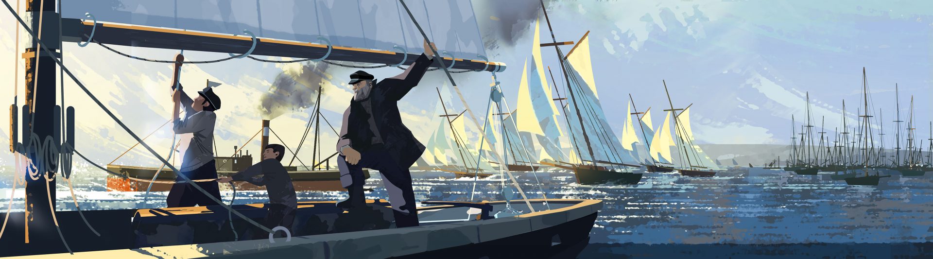
Our first phase was to document on sailboats of that period (the second half of the 19th century). The main reference for Avery’s boat was the Bristol pilot cutter. It was important to understand the primary shape of the sailboats of that era, their silhouette, and the main sails, especially the number of sails and their position. It was also very important to define, in the early stages, the length/space of the deck and cockpit where almost all of the action would take place. Designing a set for VR is slightly different than for a movie because there’s no blind spot. The most useful thing to do was to experiment with rough mockups of the set in VR ourselves, and see if we felt what we wanted the audience to feel.
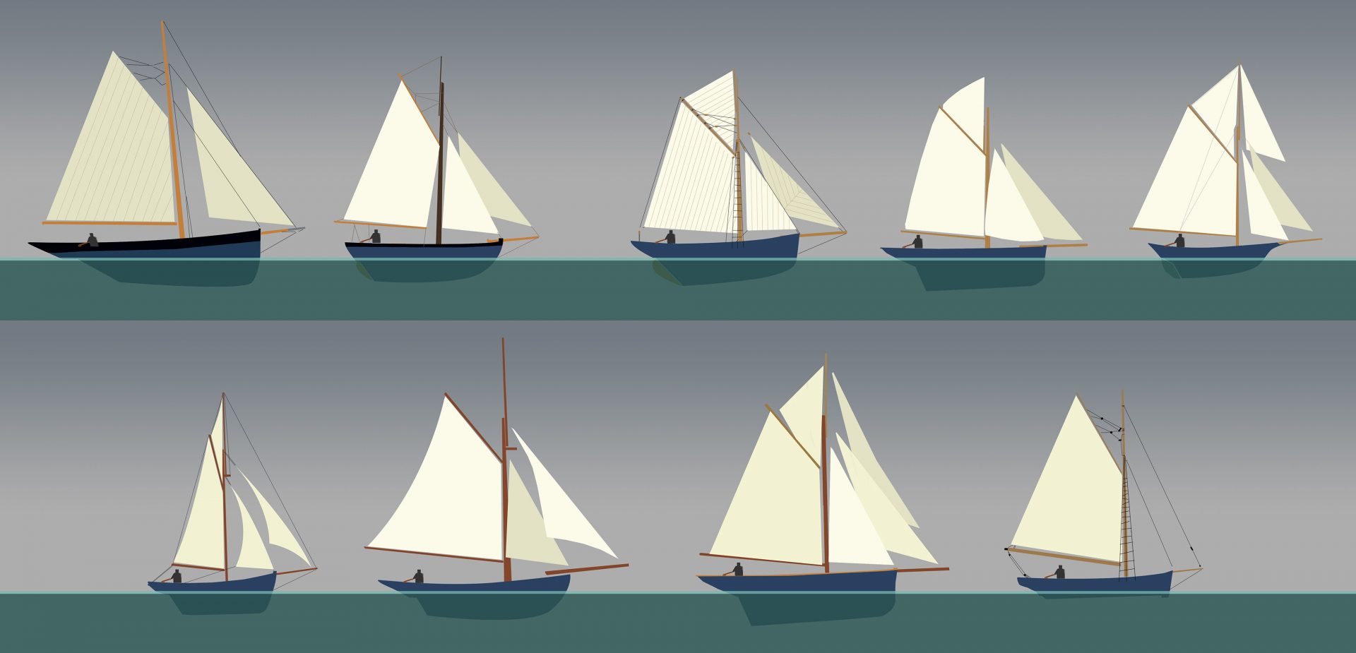
^ THUMBNAIL BOAT DESIGNS BY CELINE DESRUMAUX
CELINE: We had the chance to navigate on a sailboat in the bay of San Francisco. It allowed us to look closely at all the details of the boat. We could see how the crew were using the ropes, which ropes were raising the sails, and where it was all connected. The challenge of the rope rig was to stylize and simplify it in the same way we stylized the boat and the characters. We studied what was really important for the action and for the understanding of being on a real boat. Jasmin and I mocked up some primary rigs for the action and the immersion around the cockpit. Ropes attached to or lying on the deck are a key factor to really creating the feeling of being on a boat.
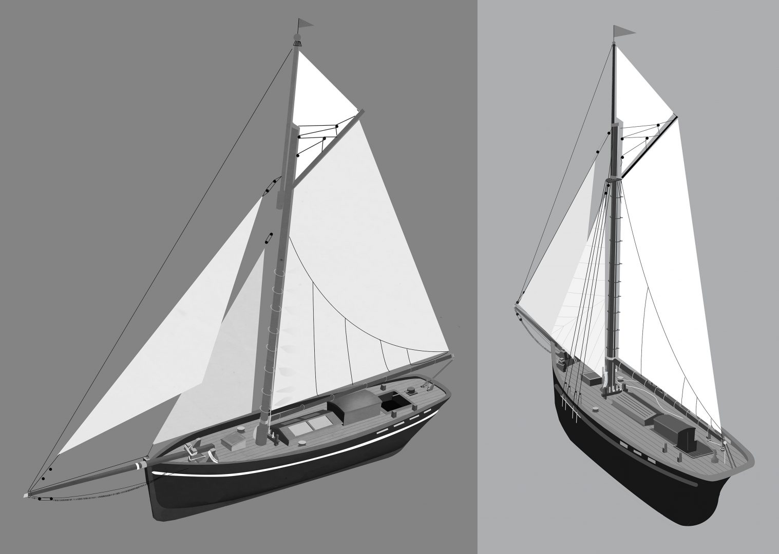
^ BOAT DESIGNS BY CELINE DESRUMAUX
JASMIN: Many of the boat parts had to be completely functional because we see Avery use them throughout the film, such as when he raises the sails during the chase sequence. Kevin was also adamant that we needed ropes everywhere, even if we weren’t always entirely sure what they did.
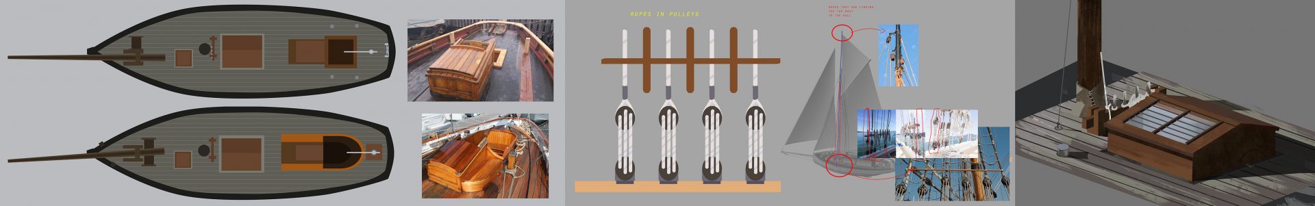
^ BOAT DETAILS & STUDIES BY CELINE DESRUMAUX
LUCY: The boat evolved very organically over the course of a few months. We started with a very basic toy-like model that Celine had made for some early 3D visualization. I would add details as the design continued to come into focus, and also spent lots of time researching to see exactly how all the parts of the boat worked and how they were attached structurally. Every part needed to look functional even if it wasn’t specifically used by any of the characters. The final boat incorporates lots of Celine’s design along with elements from our research as well as specific feedback from John. John was a constant resource of boating knowledge, and by the end of the production I also knew all of the boating and sailing terms myself!
^ CABIN LIGHTING IMAGE BY JASMIN LAI
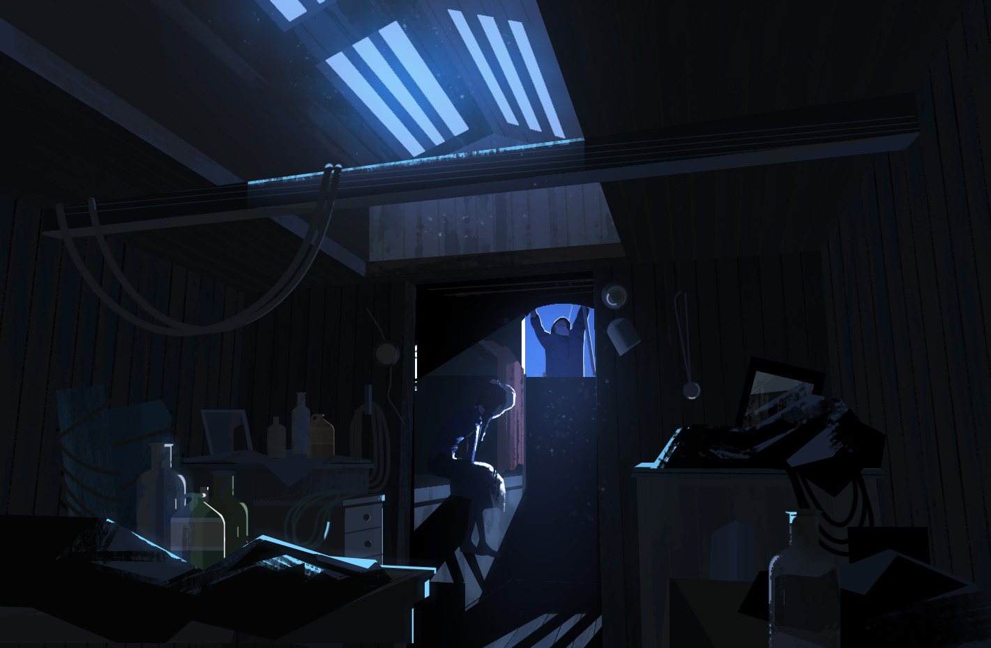
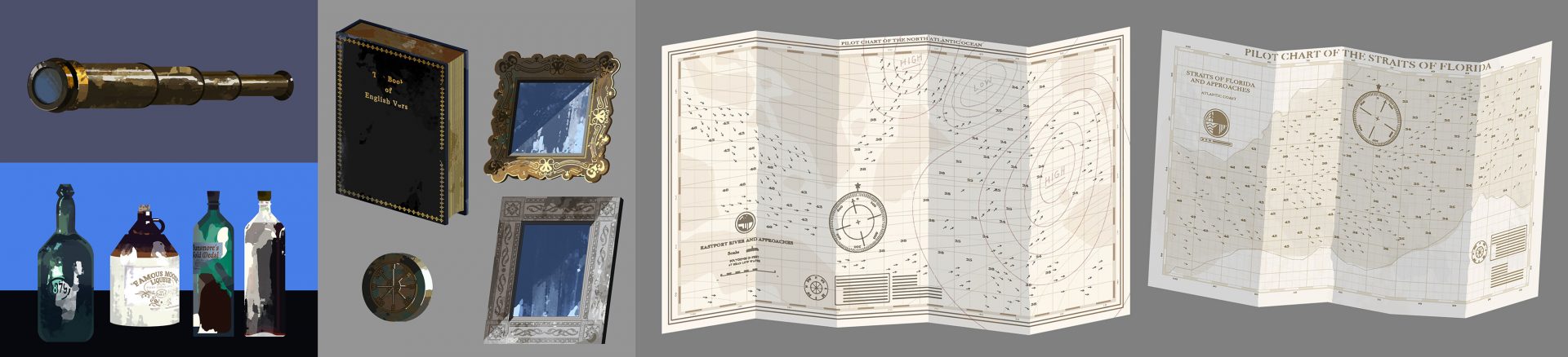
CELINE: We studied photo references from various boat cabins, but especially references which closely resembled the Bristol Channel Pilot Cutter, then we adjusted it for the purpose of the story. We added the bunk beds at the entrance of the cabin to make sure we could see Lara and the framed picture of Avery from the default camera position. In the cabin, we needed to feel that Avery stopped taking care of that room and of himself. It’s filled with random objects like rum bottles, maps, navigation props, and more ropes. We knew it will be a very dark room, where the entrance opening would be very important. We worked the design of this room according to how we would see it, to make sure the audience stays focused on the main action.
KEVIN: One of the toughest things about the cabin was capturing the dramatic lighting from Jasmin’s painting. Because we were limited to using a single directional light, we could not achieve the spread out spotlight shape that she had painted. The solution we ended up with turned out to be fairly simple and hard to notice. At the beginning of the scene, our one light is focused right on Lara, but as she gets up and starts walking the light slowly shifts to highlight the corner shelf of the cabin where Avery’s picture is. I think because we’re on a moving, rocking boat, the shifting light doesn’t seem particularly unusual, and does the job of highlighting the two points of focus in this scene.
^ CABIN PROPS BY JASMIN LAI
LUCY: The interior cabin set evolved in much the same way as the exterior. We started with a rough model Celine had made for scaling & camera placement, which Jasmin then used to paint the primary cabin concept key. I refined the model based on some plans of actual pilot cutter cabins combined with the details from Jasmin’s painting. John’s main direction was that the cabin needed to be filled with junk and show Avery’s crumbling history, so as we went along it became filled with more empty bottles and tattered maps and other seafaring clutter.
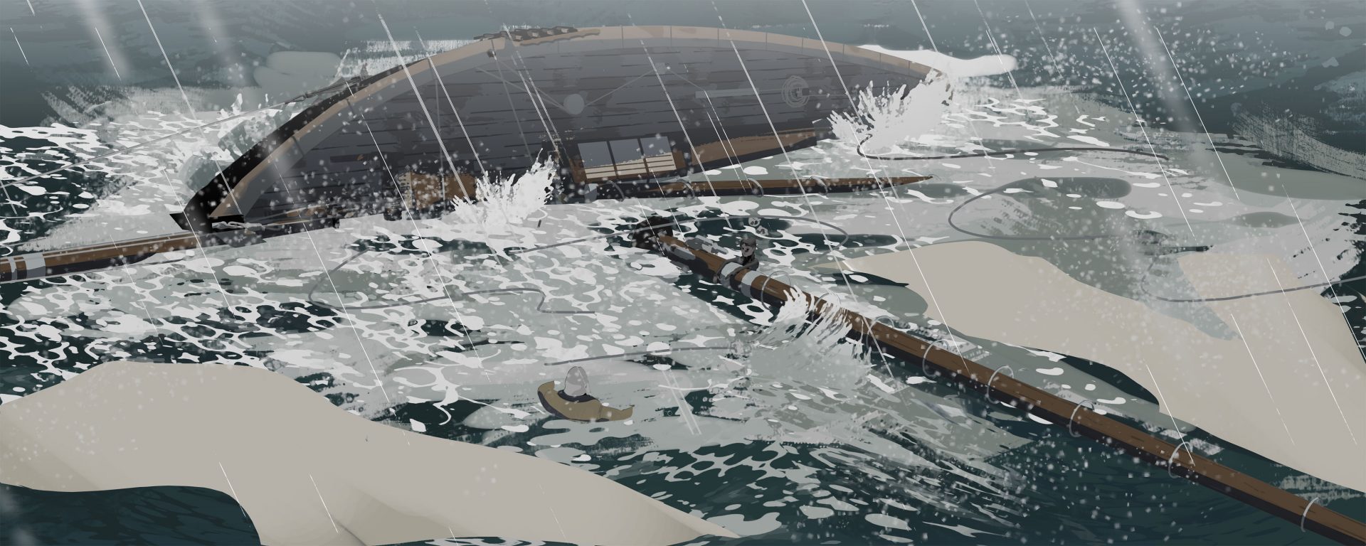
^ SINKING BOAT DESIGNS BY JASMIN LAI
TECHTECHNOLOGIEテクノロジー
THE OCEAN
JASMIN: Our first attempts at designing water were very graphic, made of sharp triangle shapes. We did some experiments to see if these shapes could be animated in a convincing way, but were never quite able to capture a natural feeling water surface. We knew that we didn’t want to replicate photorealistic water, so we had to find some point in between the two extremes. Since we had been looking at so many Thomas Hoyne paintings, I decided to take one and dissect it and study the underlying wave structure and the layers of foam and effects that made it feel so realistic. Understanding these layers and the basic shape language of the water were the key ingredients to creating our own semi-realistic water.
^ BOAT WAKE STUDIES BY JASMIN LAI
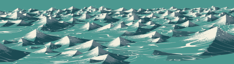
THERESA: We did spend a fair amount of time chasing stylized water surface solutions before starting to look for other possibilities. We knew that running a water simulation was one possibility, but most out-of-the-box water simulations tend to feel a bit too computer-y. What we used in the end was actually an ocean deformer, not a simulation. The deformer is based on real ocean surface data which captures points of water moving up and down. You can create an extremely realistic ocean with this information, but something we discovered is that you can play with the resolution of the data. If you pair it down to a certain degree, you get a sparse set of points that still move in natural, ocean-y ways, but create more stylized shapes. The transitions between the data points are interpreted with smooth trochoidal curves. The final water solution is made out of several of these deformers layered on top of each other along with a few standard Maya non-linear deformers.
^ EVOLUTION OF THE OCEAN SURFACE GEOMETRY BY THERESA LATZKO & CASSIDY CURTIS
As if that wasn’t enough of a challenge, we also needed to get this ocean surface to work in real-time on a mobile device. Doing that meant we needed an elegant way to economize the ocean geometry. We actually ended up making tileable sections of ocean which could be instanced to a certain distance before falling off at a pre-determined edge of visibility. In the end, the ocean was actually one of the most efficient assets in the show performance-wise!
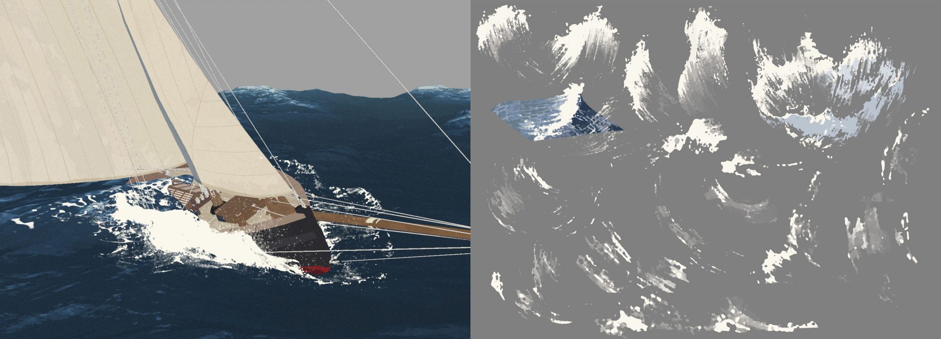
^ SPLASH EFFECT STUDIES BY JASMIN LAI
THE EFFECTS
JASMIN: The general look of the ocean surface were just one of the water challenges we tackled on this project. We also needed to figure out how to create a multitude of effects including the boat wake, splashes, and seafoam. I watched a whole lot of reference videos to study how water moves. After a fair amount of research we isolated three distinct types of splashes: directional water trails, ring impact splashes, and oblong impact splashes. I painted several variations of each of these which we then placed onto indexed texture cards that could be animated to get a randomized, jittering water effect.
^ STYLIZED 2D WAVES ANIMATION BY STÉPHANE COËDEL
STÉPHANE: I was given some isolated wave designs from Jasmin to see if I could get them to move in a believable way. I played around with a particle system, spawning these waves in offset patterns to create a wave-y surface that retained the stylization.
^ ANIMATED STYLE FRAME / DESIGN BY CELINE DESRUMAUX, ANIMATION BY STÉPHANE COËDEL
During the proof-of-concept phase I also took one of Celine’s paintings and tried to break it apart and bring it to life in AfterEffects to see how dynamic the motion would feel. We ended up going a different direction for the final water solution, but this helped to establish the feeling we were aiming for.
^ EVOLUTION OF THE BOAT WAKE BY THERESA LATZKO & CASSIDY CURTIS
THERESA: The boat wake uses the same deformer as the ocean surface, but applied in tangent space so it looks like it’s radiating outward from the boat. I built a mesh by hand which followed that outward radiating motion. With the deformer applied on top it created a wake-like effect, and at the edges of the mesh it would blend with what the ocean was doing.
^ CHOPPY WATER STUDY BY CELINE DESRUMAUX
STÉPHANE: For the theatrical version of the film, we had the chance to play up and enhance several aspects of the visuals. I’m particularly proud of the water sparkles we added during the sequence when Avery and Lara are arguing. We had to create a particle system which matched the camera angle in order to create some realistic sparkles which gave a sense of where the sun is in each shot.
This also provided a chance to match the final film frames as close as possible to Celine’s color keys. We made a decision to tweak the color of the big storm to be even darker and more threatening, which required slowly changing the color of the film across 30 shots while the storm in approaching without any jumps in continuity. We also enhanced the look of the storm sequence by breaking any hard edges between the storm and the sea to make it more atmospheric.
^ 3D RENDER & FINAL COMPOSITED PICTURE COMPARISON
Some of the effects had been designed to work from specific angles in VR but did not work from the angles we chose for the theatrical version. One of these instances was the bubbles in the underwater scene. We completely re-created the 3D bubbles in AfterEffects using the same artwork for the VR version, but with a more robust particle system where we didn’t have any real-time engine limitations. This gave us a lot of control over the amount of bubbles and where we could place them.
Certain shots also required brand new paintings to be done. The wide shot of the boat floating alone on the calm sea at the start of the argument sequence was filmed from an angle outside the boat that we never see in VR. We made a new sky paintings to get the storm arranged in a more threatening way, and also did a lot of processing and readjusting of the ocean surface to make it extra still and to accentuate the feeling of isolation.
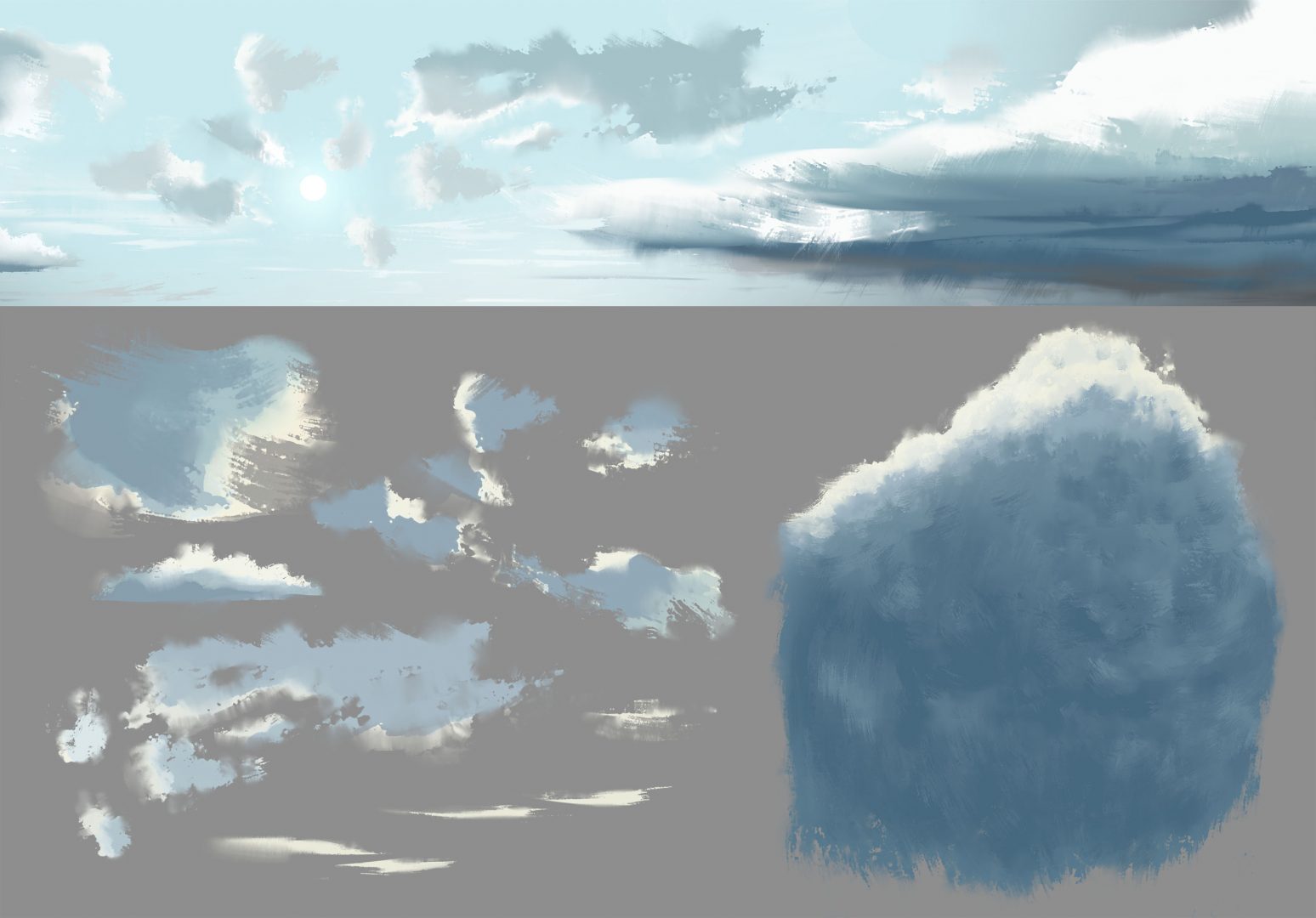
^ STORMY SKY PANORAMA & CLOUD TEXTURES BY JASMIN LAI
THE STORM
JASMIN: To help tie everything together visually, we wanted to take the same general approach to creating the skies and clouds that we did for the water. Instead of blobby, liquid-y shapes, we used dryer and wispier shapes for the clouds. Celine’s lighting keys gave a great blueprint for the colors and general impression of the clouds.
LUCY: Each sky started with a large panoramic painting that Jasmin would create and then expand so that none of the clouds were cut off at the edges of the frame. I could then take those clouds from the layers and map them onto individual planes, while the main background would be mapped onto a sphere. Using the moxy viewer camera I could look around the check that everything in the sky looked good and adjust as necessary, or sometimes go back to Jasmin to ask for more clouds. I also added some very subtle drifting animation to the clouds in every scene to help the sky feel alive.
JASMIN: For the big storm, there was a lot of back & forth collaboration between myself and Lucy to get it just right. I first did a big panoramic painting of the stormy sky, from which we broke out the big storm cloud and tried to model it. I painted a flat bottom view of the cloud which would make up the underlying surface in 3D, and a flat front view which you would see when looking at the storm from far away.
^ WEATHER TRANSITION PRE-VISUALIZATION BY STÉPHANE COËDEL
STÉPHANE: Before attempting to make the entire storm in 3D I was first asked to visualize the transition in 2D to see what we might need to do to create a convincing storm transition. I tried to simulate the VR point of view, and using two pieces of artwork – a sunny sky and a stormy sky – I played with ways to make the sunny clouds get darker and more threatening, and also how to get the stormy clouds to move in without attracting too much attention. This was also our first chance to try out effects such as rain and lightning. This test helped sell the idea that we could fake an entire storm using just 2D artwork.
^ BUILDING A STORMY SKY IN 3D BY LUCY XUE
LUCY: The transition from the bright daytime sky to the storm definitely required the most elaborate setup. The skydome transitions between three different states using a shader Cassidy built which allowed us to fade from one texture to another. He also built a shader with an erosion attribute that gave us the ability to make smaller clouds disappear in a way that felt natural. The main storm cloud is modeled on what is essentially a sled-shaped piece of geometry. Jasmin’s cloud paintings really helped sell the illusion with some very convincing lighting.
Because our 3D scene had a finite size that was much smaller than a real sky, we couldn’t make the storm real-world size or it would clip through the skydome. To make it feel like it was coming from really far away, when the cloud is approaching it’s actually mostly scaling and stretching out as opposed to traveling a large distance. It ends up being a bit of a forced perspective trick like you might see at a theme park. What really sells it though is the movement. We had to tune the motion very carefully so that the cloud covers the distance it’s supposed to, but without moving so fast that it looks fake.
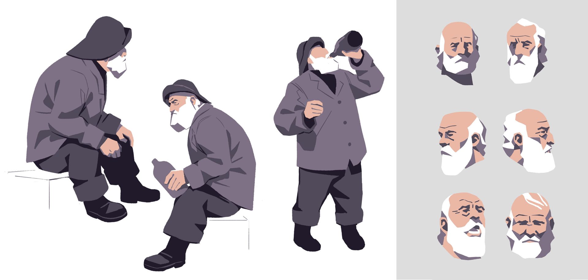
^ EARLY AVERY STUDIES BY JASMIN LAI
CHARACTERSPERSONNAGESキャラクター
CELINE: Our two main characters are Avery – an old sailor who can no longer find his place in the world – and Lara – a young aristocrat who falls from the steamliner. The two characters were the exact opposite of each other in size, age, and mindset. One is about to start life and the other just wants to escape it.
Designing the characters was a combination of a few different factors: bringing together two completely opposite characters (physically and also spiritually) but also conceiving them with the constraint of virtual reality and real-time graphics. Much of the story is based on the emotions, dialogue, and feelings of the characters. We had to find a balance between a simple design and the ability to give complex emotions.
JASMIN: Before we landed on our final approach to the characters, we started with some very rough explorations of shapes and poses. John had Ian McShane in mind of the voice of Avery from very early on, so he sort of entered everyone’s head as a reference point in the design.
CELINE: We were really interested in the treatment of the shadows in the work of some mid-century illustrators, and especially how shadows would fall over the eyes. You can feel so much in a character without even drawing the eyes. Kevin referenced the way Clint Eastwood’s eyes would often disappear in shadow in his classic Western films.
Everything felt aligned with the stylistic direction we took for the boat and all of the other elements. We knew this approach would be a perfect fit for designer Bruno Mangyoku, who joined the team and did a wonderful job at character design. His designs really brought everything together.
^ AVERY DESIGNS BY BRUNO MANGYOKU
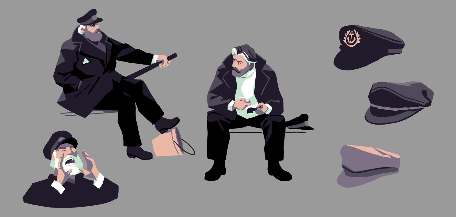
JASMIN: Similar to the boat and every other aspect of the world, a lot of research went into designing Avery and Lara to make sure they clearly felt like they were from a certain period. In some of our early explorations before we had finished our research, a lot of our Avery designs looked like a fisherman. Once we saw the traditional attire of Victorian-era captains, his outfit evolved to its final state.
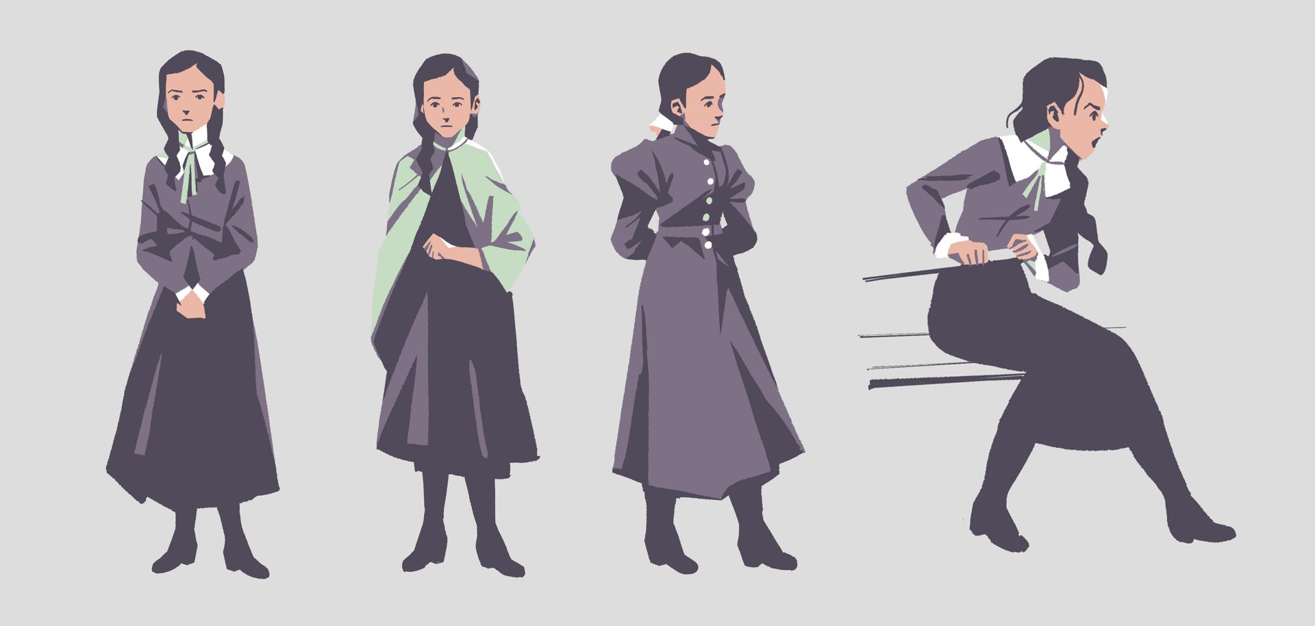
^ LARA DESIGNS BY BRUNO MANGYOKU
CELINE: For Lara, we needed those little extra details that make the audience understand the time period, but also the social class of Lara. The clothing of an aristocrat woman can become really complex, due to the style of clothing at that time which were adorned with lots of lace and ribbon. We tried to incorporate those details in her textures. We looked at a lot of women’s’ portraits of that era, trying to find any tiny details that could make everyone understand the era and social standing of this character, but also keep her design as clear and streamlined as Avery.
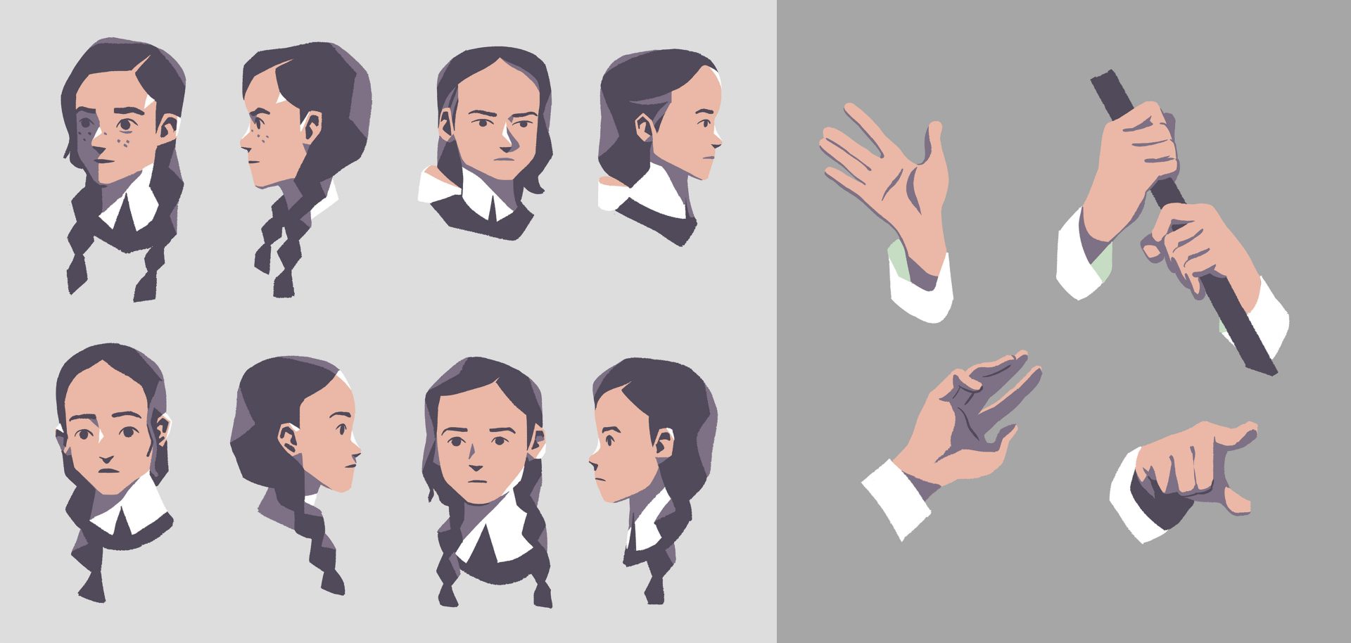
^ LARA FACE & HAND STUDIES BY BRUNO MANGYOKU
LUCY: Similar to the process with the pilot cutter, creating the characters in 3D was a very organic process and involved a lot of back & forth with the team and John. I thought Bruno’s designs were really cool because they didn’t follow typical rules of animation design. It gave us an interesting challenge to figure out how to incorporate the 2D intentions of his designs in 3D. I tried to capture some of the organic wobbliness, which made everything feel more organic and lifelike.
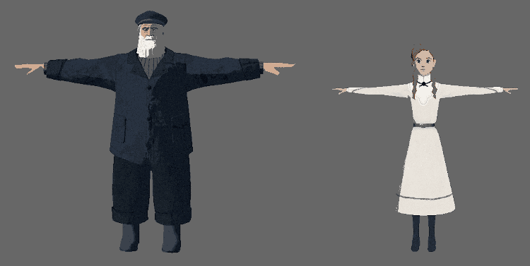
^ AVERY & LARA MODELS BY LUCY XUE
KEVIN: To achieve the look that Celine and Jasmin had developed, we made an interesting stylistic decision for the lighting approach. The lights do not function in a traditional sense – instead of dynamically creating shadows, the lights reveal specially painted shadow textures in the areas not receiving light. This gave us a lot of control over the exact light and shadow color for every object and detail, and allowed us to do some cool things like have lines on the boat deck actually become lighter when in shadow. One of the coolest parts though was the way the light areas transitioned into shadow. Cassidy developed an amazing shader which put a stylized paint texture into those transitional areas, which made the light falloff feel much more natural and gave the illusion that there was more detail on the models than was actually there.
^ ANIMATION PROGRESSION BREAKDOWN
ANIMATIONANIMATIONアニメーション
NETH: This project presented quite an enormous undertaking for the animation team! Some of the sequences were over 2k frames! Usually we would split each sequence up between 3-4 animators. Each animator could take anywhere between 600-1,200 frames at a time. It was ambitious and difficult because we had animators all across the world and we always had to be in sync. We had to constantly communicate with each other to make sure our acting was in character, to share our poses, and to stitch our shots together for continuity review.
Since Age of Sail is in VR, animators had to make sure it looked good from every angle. We didn’t have a lot of room to make mistakes, so getting our layout animation done for every sequences was critical for the film.
The acting style of the film is pretty realistic. All of our character animation is in 2s and 3s, whereas the sailboat is in 1s. You’d think animating in 2s or 3s would speed up your animation production, but it didn’t. Because Age of Sail is such a stylized and specific film, it required even more attention to hone into those acting and pose details with perfection. Having Ian McShane and Cathy Ang as our main voice actors only helped our performance even more; they have such wonderful voices and ranges to work with.
^ YOUNG AVERY DESIGNS BY BRUNO MANGYOKU
^ PROLOGUE LIGHTING KEY BY JASMIN LAI & CELINE DESRUMAUX
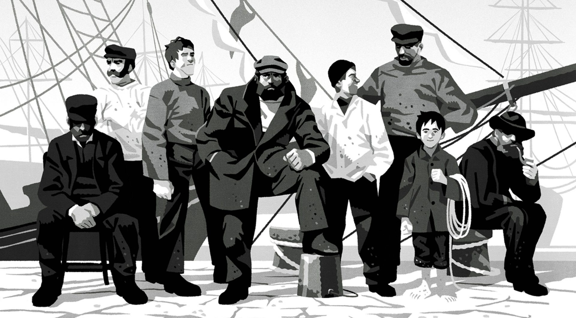
^ PHOTO OF AVERY AND HIS CREW DESIGNED BY BRUNO MANGYOKU
PRODUCTION CREDITSCRÉDITSクレジット
DIRECTED BY
John Kahrs
PRODUCERS
David Eisenmann
Gennie Rim
EXECUTIVE PRODUCERS
Karen Dufilho
Jan Pinkava
MUSIC BY
Scot Stafford
CAST
Ian McShane as William Avery
Cathy Ang as Lara Conrad
STORY BY
John Kahrs
WRITERS
John Kahrs
Blaise Hemingway
Jonathan Igla
EDITOR
Jeremy Ambers
COMPUTER GRAPHICS LEAD
Cassidy Curtis
CREATIVE DIRECTOR
Kevin Dart
DIRECTOR OF PRODUCTION
Myles Shioda
PRODUCTION DESIGNER
Céline Desrumaux
ART DIRECTOR
Jasmin Lai
CHARACTER DESIGNER
Bruno Mangyoku
RIGGING
Koki Nozawa
ANIMATION LEAD
Neth Nom
ANIMATORS
Lauren Adassovsky
Kevin Nguyen
Lucas Fraga Pacheco
Sikand Srinivas
Mette Tange
John Turello
TECHNICAL ART LEAD
Theresa Latzko
CG ARTIST
Michelle Kwon
Lucy Xue
FX ANIMATOR
Fernando Penafiel
LEAD COMPOSITOR
Stéphane Coëdel
COMPOSITORS
Jess Iglehart
John Taylor
Rob Ward
PRODUCTION COORDINATOR
Bryan Wolfson
ADDITIONAL HELP
Thibault Leclercq
Jonathan Djob Nkondo
Theotime Vaillant
PRODUCED IN ASSOCIATION WITH
Google Spotlight Stories
Broad Reach Pictures
Evil Eye Pictures