Case Study2B
© COPYRIGHT MMXVII SURVIOS. ALL RIGHTS RESERVED.

2D ANIMATION / 2017
PROJECT OVERVIEWRÉSUMÉ DU PROJETプロジェクト概要
Sprint Vector is an adrenaline-pumping VR racing game developed by Survios. The premise involves a game show hosted by a twisted mad man – Mr. Entertainment. His high energy and eccentric taste has to come through in design, animation and story.
Survios asked us to create a stylish animated trailer that would introduce the world and contextualize the game. They came to us with an initial rough concept and music, but then gave us the reins to make the most high-energy whacked-out minute of animation we could muster!

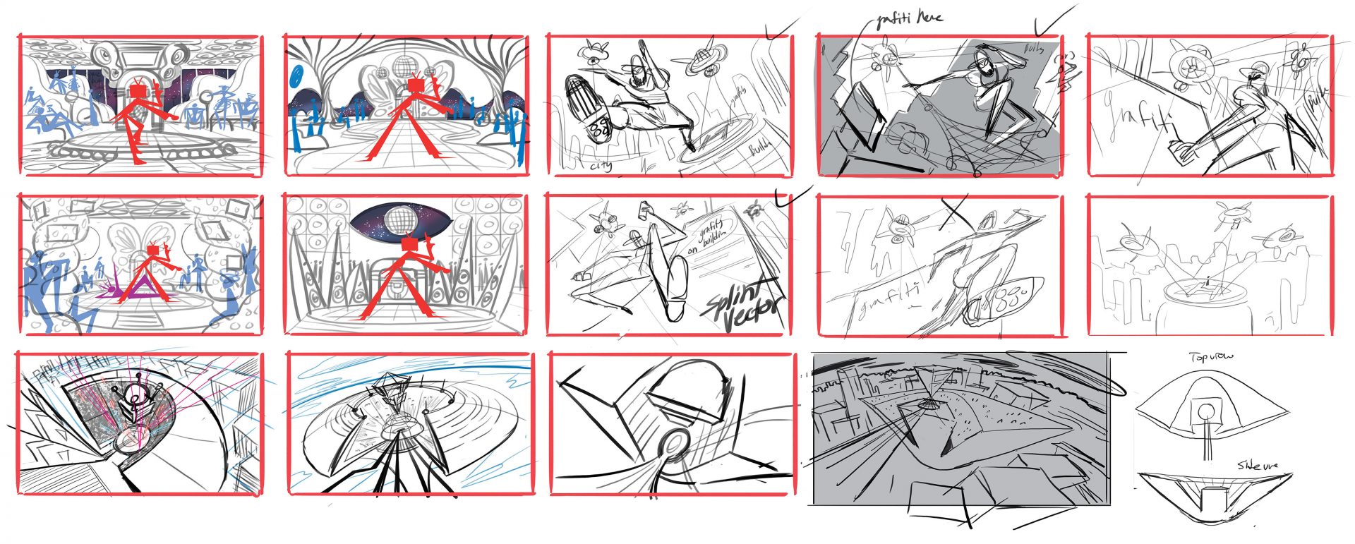
^ SCENE THUMBNAILS BY SYLVIA LIU
DEVELOPMENTDÉVELOPPEMENTディベロップメント
EUSONG: When developing the initial pitch, we pulled ideas from many different things, such as 70’s psychedelic funk-pop, Japanese game shows, and Neo-Noir urban landscapes to create the funky and twisted universe of Sprint Vector.
SYLVIA: The story and concept of the idea really drove the inspiration and references we were drawn to. It was a very high intensity, fast-paced wacky kind of world and we needed to find a style of animation/composition/design that would suit the mood. We looked at number of things like hypervisual funky disco fashion and photography from the 70’s. Eusong also put together a really cool playlist of music that helped inspire the whole mood, which consisted of retro Japanese funk and other things.
^ COMPOSITION IDEAS BY EUSONG LEE
SYLVIA: We wanted the compositions to really stretch and widen with extreme angles to help emphasize the speed and zaniness of the world. We made lots of use of fisheye lens, extreme perspectives, and downshots so that you could really feel the movement of the characters. The world is also supposed to be kind of dark and twisted so I think the angles of the shots help make it feel a bit uncomfortable but still fun.
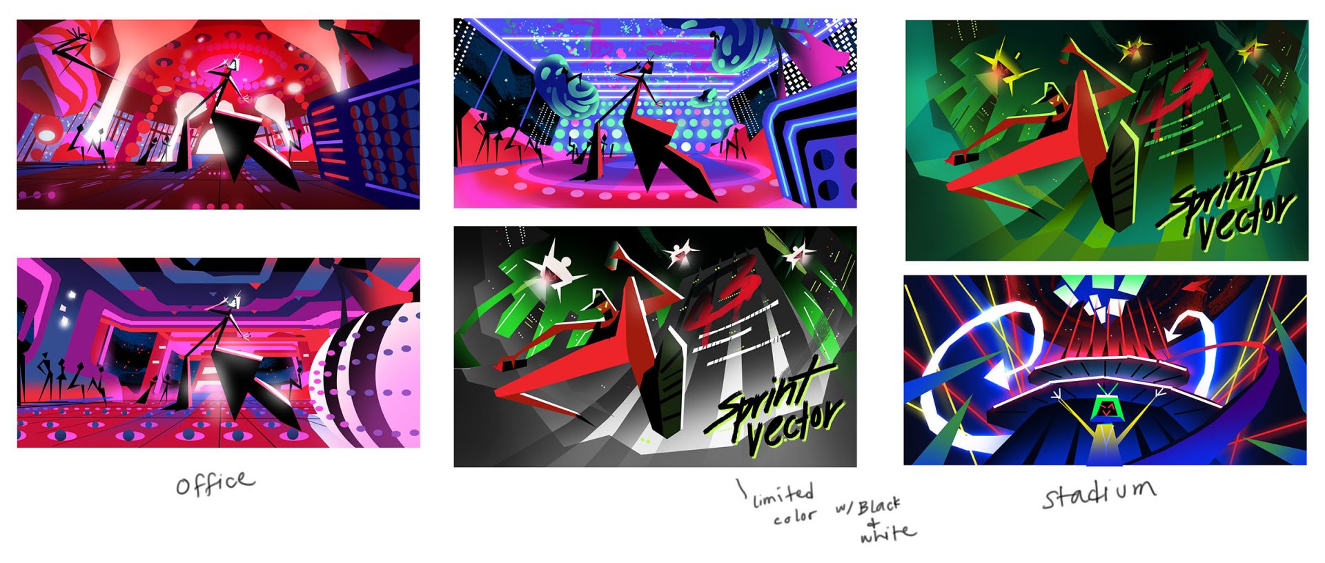
^ COLOR STUDY THUMBNAILS BY SYLVIA LIU
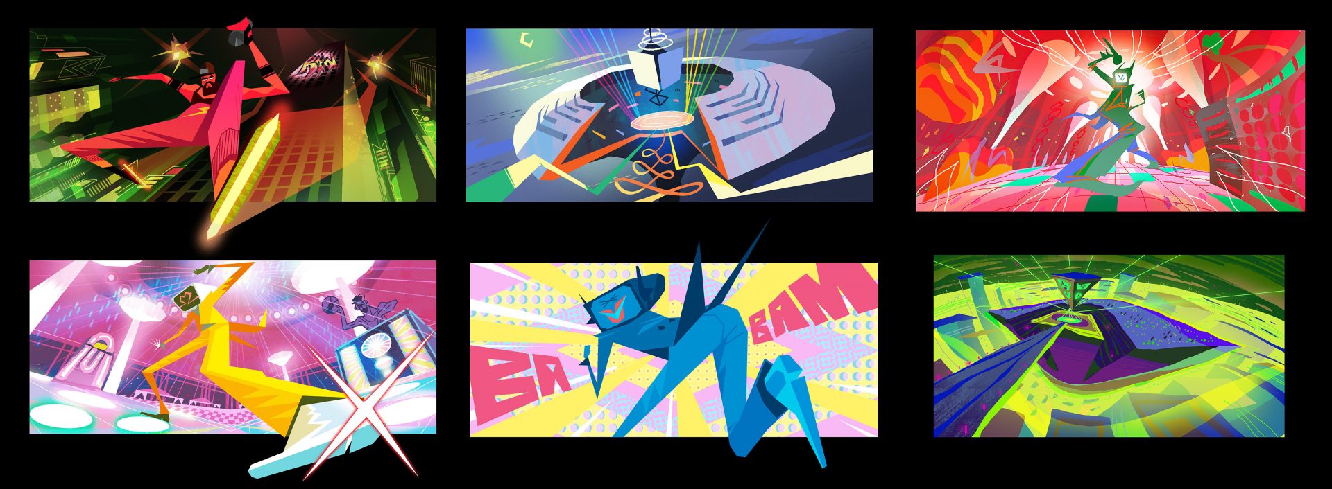
^ COLOR THUMBNAILS BY SYLVIA LIU & EUSONG LEE
EUSONG: While the art direction maintains some of the graphic quality typical of our projects, everything also needed to feel organic and kinetic. The designs can create illusions of movement by using wobbly edges or dynamic poses.
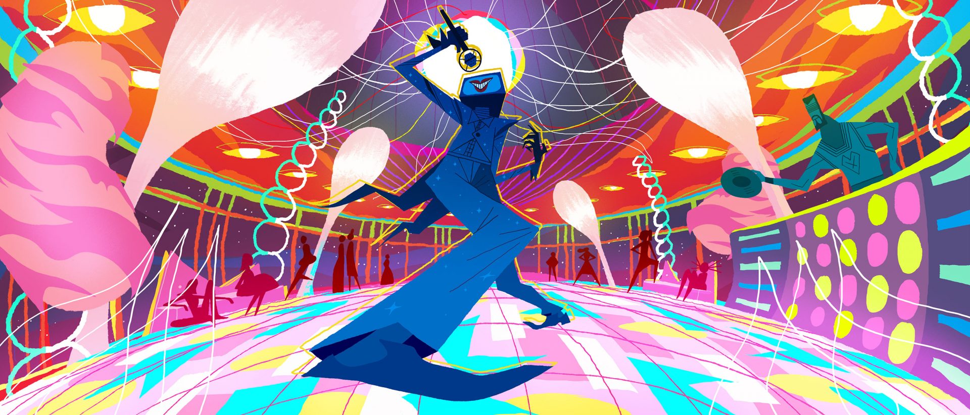
^ MR. ENTERTAINMENT STYLEFRAME BY EUSONG LEE & SYLVIA LIU
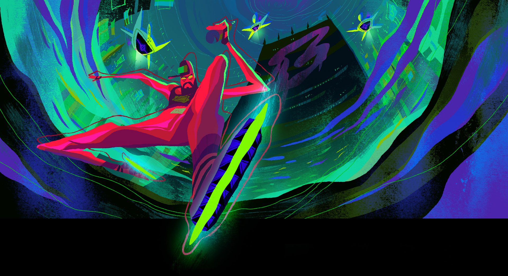
^ RED GUY STYLEFRAME BY EUSONG LEE & SYLVIA LIU
DESIGNDESIGNデザイン
EUSONG: These characters needed lanky limbs and fun proportions which could emphasize their movement when they run or dance. We would further exaggerate and stretch their action poses by getting all of their joints hitting hard curves and accentuating the movements with fisheye style distortion. Even their toes and hands are often curled up as if they are always tensed up.
We also decided to have dot eyes on the characters so that we are more focused as viewers on their gestures and actions rather than their expressions since action is what the game is all about.
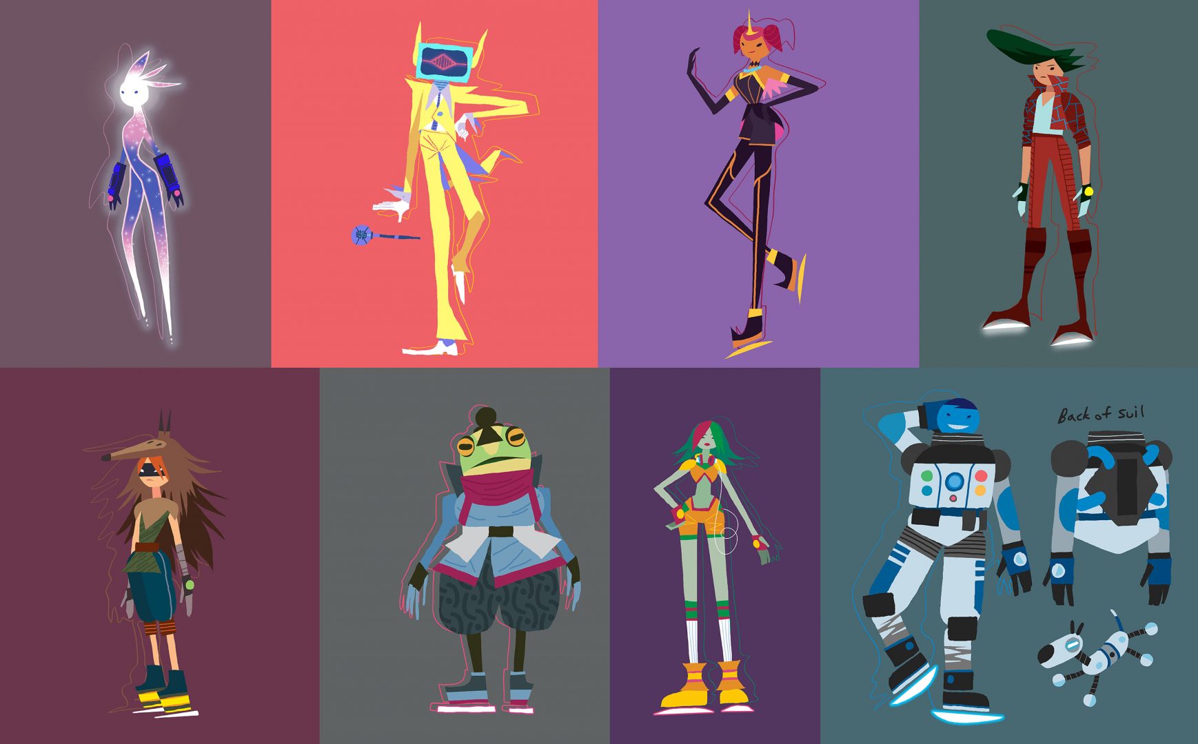
^ CHARACTER DESIGNS BY EUSONG LEE
SYLVIA: When I made the colorscript I was really inspired by a lot of the powerful colors in 70’s psychedelic funk and the space-age references we gathered. They used so many different vibrant and saturated colors but all worked well together. I essentially wanted to make the colorscript feel like a big funky disco club.

^ COLORSCRIPT BY SYLVIA LIU
When we started to make the final BG paintings we explored a few different styles before we came to the final look. We tried more graphic/hard edged shapes, outlined characters, textured, and without textures. The look we eventually landed on was very organic and we used a lot of freehand lasso tool to create more wavy silhouettes, with many colors layered on top to give more depth and texture without actually using texture.

^ STADIUM BACKGROUNDS BY MAXIME DUPUY & JASMIN LAI
ANIMATIONANIMATIONアニメーション
EUSONG: The central element which ties all of the characters and different vignettes together in the trailer was the process of Mr. Entertainment collecting players for the deadliest game in the universe. We used his actions of collecting players repeatedly while in between we would establish a bit of the characters’ origins and backstories.
Mr. Entertainment establishes the mood and eccentric taste. We focused the big action scenes on Red Guy and Blue Guy trying to escape the collecting machines. We also used quick split screen compositions to quickly introduce the other characters which made it feel more game-y while maintaining the high-energy pacing.
The animation approach we took involved very snappy motions to give an impression of fast movement and created more impactful poses, as opposed to full animation which could have made the movement feel slower. Even in the backgrounds, everything is jittery and shaky the entire time like you’re on constant state of high-alert.

^ STORYBOARD TO FINAL ANIMATION COMPARISON
COMPOSITINGCOMPOSITING基礎の構成
EUSONG: We focused on two key effects in the compositing. The first was chromatic aberration, which is an effect that will split the color channels apart into separate images. We’ve used this effect a lot in past projects to lend a slight vintage feel, but here we exaggerated it to an extreme degree to create dancing color silhouettes around the characters. We even used the chromatic aberration to create a new type of depth of field effect. When an object went into the background the colors would separate even further, while if it was in focus the colors would stay closer together.
The second effect was putting turbulence displacement on every element. We applied this to almost every layer in the scene with an offset applied so that everything would feel as if it was moving independently. This, in combination with the chromatic aberration helped created a dancing neon sign kind of feeling across the film.
^ COMPOSITING PROCESS BREAKDOWN BY STÉPHANE COËDEL
STÉPHANE: The sketchy double lines on the characters also enhanced the frenetic style. I would take the character animation, isolate the alpha and the colors, then thicken them and re-fill them with the color that we wanted. With an added turbulence effect we ended up with some cool outlines dancing all around the characters.
PRODUCTION CREDITSCRÉDITSクレジット
DIRECTED BY
Eusong Lee
ART DIRECTOR
Jasmin Lai
DESIGN
Sylvia Liu
Maxime Dupuy
ANIMATION
Léa Justum
Camille Vincent
Katrina Ruzics
COMPOSITING
Rob Ward
Stéphane Coëdel
PRODUCED BY
Chromosphere
CREATIVE DIRECTOR
Kevin Dart
DIRECTOR OF PRODUCTION
Myles Shioda
SOUND
Shane Kneip
MUSIC
Spencer Kitagawa
